

How Marketers Should Use Specific Data Visualizations

Data visualizations and interactives are increasingly popular amongst marketing circles for their ability to present data in a compelling and digestible form. They take advantage of our strengths in visual processing to aid in comprehension and interpretation of data and when done right, they grab attention, engage and further the impact of the underlying message. However, if your data isn’t properly presented, its meaning and intention can get distorted.
Creating a good data visualization is far more challenging than just deciding between a bar graph and a pie chart. Below we’ll break down some interesting data visualization types and discuss why they work best for their data sets.
Choropleth Maps
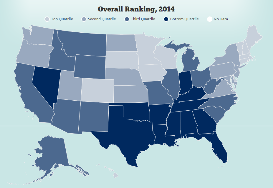
Choropleths have each area shaded in proportion to measurement of the statistical variable being represented on the map. This particular choropleth map from The Commonwealth Fund serves as a powerful tool to compare the state of healthcare across the US. A common error made when designing choropleth maps is the improper use of color. When different colors are used to represent a single indicator, the data could be misinterpreted as some colors stand out more than others. Instead, the use of a range of shades in a single color better represents the variation for that given indicator. For example, the darker blue in this map shows the states that have the poorest healthcare systems.
There are some drawbacks to choropleth maps too. For example, they are biased towards regions that occupy a larger geographical area.
Networks
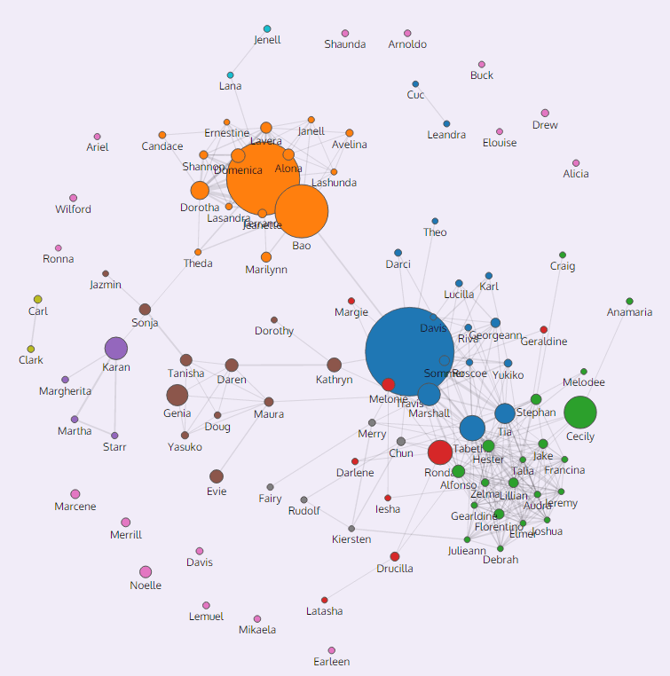
Networks provide an engaging way to explore the connection between different data points. This team created a visualization, Immersion, which takes visitor’s data and converts it into an interesting story in a few minutes. By using your email metadata (to/from, timestamps etc.) as inputs, it shows you the connections you’ve made over the years and aims to help improve the effectiveness of your professional and personal communications. The use of the Network visualization type works well because the requirements entail the need to display communication frequency (size of each dot), in addition to relation (connections between various dots). The ‘personal’ element to the data also give this visualization the much sought-after “viral” edge. Click on the image to try it with your own data.
Donut Charts
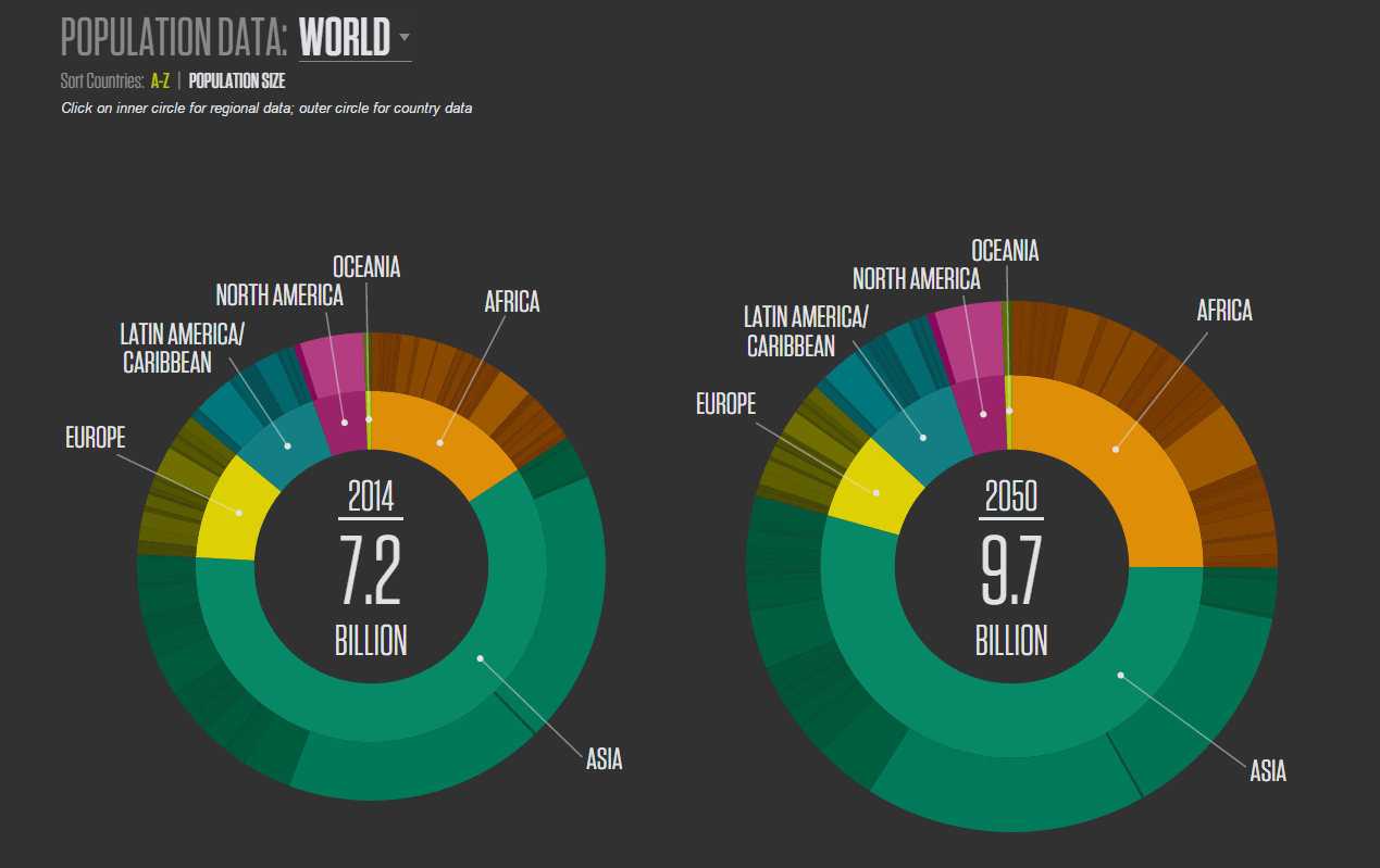
Population stories can be difficult to depict, especially when you’re dealing with a data set for the entire world’s population, as was the case with PRB’s World Population Data Sheet. The use of the donut chart here provided the right level of functionality from a number of different perspectives. It enabled a great amount of interactivity, which keeps the user engaged and involved with the data (click on the image to play around with it.) It provided the perfect way to show the related data point (on hover) and still keep the design clean, instead of showing all of the data points at once and cluttering up the page.
A donut chart was the right choice to show accurate proportions both at a continent and country level. It was especially useful since the hole in the middle allows room for the hover value. Normally, you would start the largest data point at 12 o’clock going clockwise but PRB opted to alphabetize the sections instead to make it easier to find a given country/region. There also is the option to sort by value which allows users to view the most populous regions.
Targeted Interactives
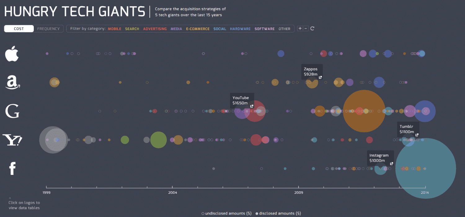
One of the areas in data visualization that has seen the biggest rise in popularity is the category of infographics. They're on the minds of every good content marketer, which means there are plenty of them all over the internet. Even the most informative infographic can get overlooked due to the sheer volume of this particular category. A great way to make yours stand out is by taking the static image and transforming it into an interactive. This particular interactive depicts a history of acquisitions by the major tech giants - Apple, Amazon, Google, Yahoo, and Facebook. You can hover over the different bubbles to see what company was acquired and at what cost.
Thanks to a wide range of tools, including Velir's own Datacenter, data visualization is becoming an easy and interesting way to communicate with your audience. We're excited by the evolution this space has seen in recent years and by the resulting storytelling that will reinforce different data sets. Feel free to join in the conversation by commenting below on how you incorporate data visualization into your marketing plan.