

Data Visualization for the Web: A Look into Velir’s Datacenter

Intro to Data Visualization
Data has become one of the chief commodities of the modern age. It can be used to measure performance and tune business strategies, to appeal to advertisers and investors, or to tell a story. Many companies in recent years can attribute much of their success to their ability to capitalize on data – Facebook and Google are two very prominent examples of this. But even the most extensive, valuable data has little worth if it is not displayed in a useful way. Well-presented data can illuminate relationships between different pieces of information, expose trends, and allow us to understand difficult concepts in a way that can be digested quickly and easily. This is the function of data visualization.
The Interaction Design Foundation describes data visualization as “the graphical display of abstract information for two purposes: sense-making (also called data analysis) and communication.” While this definition may seem broad, it underlines how commonplace data visualizations actually are. In fact, many ways to visualize data are familiar to any elementary school student; tables, histograms, pie charts and bar graphs are all types of data visualization that have been used effectively for centuries. Early scientists and explorers used the principals of data visualization to understand the positions of stars and other celestial bodies, to make maps that could aid in navigation and to create geometric diagrams to represent mathematical principles.
The New Frontier of Data Visualization
Although it has a very long history, the field of data visualization has been going through a technological and creative renaissance in recent years. There are many specialized software products available, enabling individuals and organizations to create increasingly sophisticated visualizations from many different data sources. Major media outlets such as the New York Times are employing large data visualization teams and are investing significant resources into creating unique and complex visuals to enhance their delivery of news and information.
Much of our work at Velir focuses on our clients’ need to present large amounts of data in a visually compelling and intuitive way. Organizations such as the Robert Wood Johnson Foundation, the Commonwealth Fund, and the Lucile Packard Foundation for Children’s Health, rely on presenting extensive data sets to educate and inform the public and to measure the impact of their work. Although the data itself varies widely from project to project, and each solution is unique, our end goal is always the same: to deliver a finished product that is engaging for end users, and easily managed by editors and administrators. To help us accomplish this, we’ve developed our own proprietary platform to help our clients manage and visualize data: Velir Datacenter.
What is Datacenter?
Datacenter is Velir’s signature data management system, and is used to transform formatted data into infographics, tables, maps, graphs and other visualizations. Essentially Datacenter operates much like a content management system – however it’s heavily focused on publishing data.
Datacenter provides web-based data reporting systems that can be easily navigated by end users. Menus, profiles and reports are all easily created through Datacenter’s relational abilities. Datacenter can be used to completely power a web site, or used as a tool to integrate into your website. Virtually any kind of structured report data can be used with Datacenter, and can be easily accessed and managed through the web.
How does Datacenter work?
In many data reporting systems, each data set exists independently of each other. With Datacenter, the power of the tool lies in its ability to relate data sets to one another. Data subjects (such as states, cities, races, genders, years, etc.) can be cross-related in order to report data that spans multiple data sets. For example, when one data set has data for “Massachusetts”, Datacenter knows that another data set’s “Massachusetts” is the same place. These types of relationships can be combined to do things such as “get all educational data for white males under 18 in Massachusetts for 2008.”
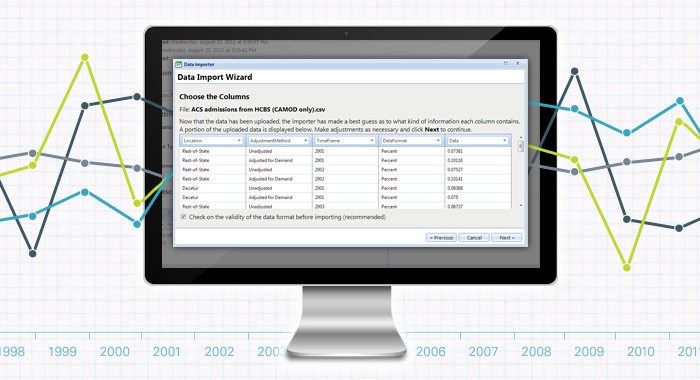
Once data has been imported, it can then be managed through an intuitive administration system where authorized users can manipulate data values, time frame ranges, meta-data such as notes and sources, and virtually any other aspect of the system.
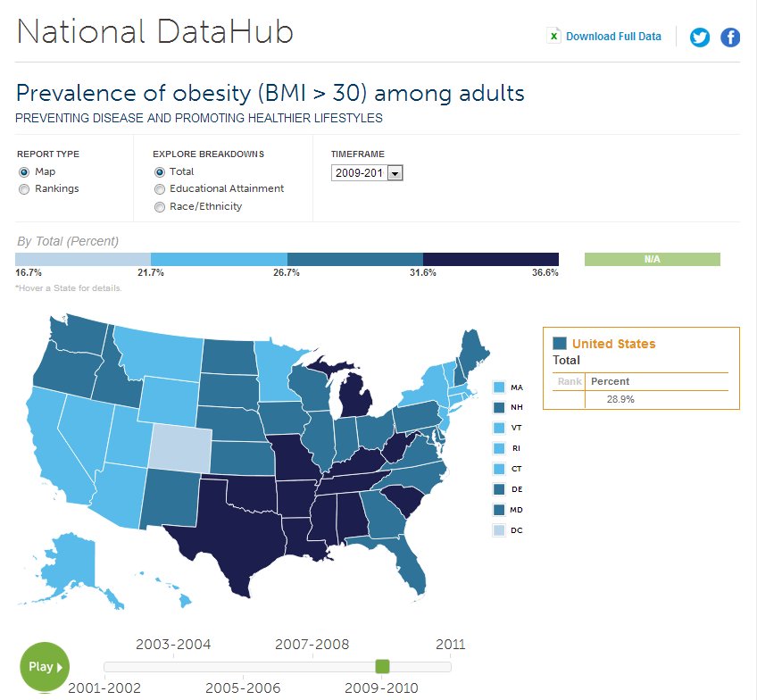
Our team of data visualization experts works closely with our clients to create an overall aesthetic and determine how to best present customized data – as infographics, tables, maps, graphs, etc. Visualizations can be built into an existing CMS such as Sitecore or Adobe CQ, and integrated with 3rd party tools such as the full set of Google visualization tools, various mapping platforms and others.
Datacenter was built to complement existing business intelligence and statistical data analysis tools. These systems process raw data into final data sets that can be uploaded into Datacenter, enabling them to be published and visualized on the web in a flexible and easy-to-manage manner.
More information on Datacenter is available on our website.