

Visualizing Data Uncertainty: An Experiment with D3.js

In this post, I'd like to discuss some different ways to use uncertain data in simple visualizations. Although there can be value in data "vizzes" that tell a story, for this post I'll consider that the purpose of a data viz is to:
- Tell the truth, the whole truth, and nothing but the truth
or more specifically,
- Visually convey the data as completely as possible, so not to mislead the viewer
Even with the best intentions, there are many ways in which one can unconsciously mislead the viewer. For my first example, before we get into uncertainty, we'll need to consider the difference between data whose domain is continuous or discrete.
Discrete vs. Continuous Data Domains
A discrete domain means that the entities about which data is collected are separate - think "average American income in year X" or "height of each of your family members". It doesn't make sense to ask about the average annual American income in the year 2013.57, because that quantity is an aggregation over the entire calendar year. Conversely, a continuous domain means that between any two data points there could always be another, if we were able to measure it. Examples of this include the speed of your car or the number of children in hospitals at any given time.
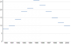
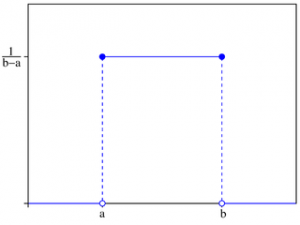
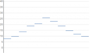
The Discrete Equivalent of Dot Plots
Given that you are reading this, you are probably familiar with how to make a dot plot. Each data point has values from the domain and range (think x and y), and a dot is placed on the graph centered at those coordinates. This can be misleading behavior for data with a discrete domain, because the data value applies to the entire corresponding domain entity. Consequentially, it is more accurate for the plot to span the entire domain element; all points at any particular height above that element are equivalent.
The discrete equivalent of the dot plot, then, is a graph where each data point is plotted as a horizontal line segment:
The Notion of Uncertainty
Now let's introduce uncertainty to the mix. Traditionally, uncertainty is (if it's not just ignored!) conveyed graphically with error bars denoting the top and bottom of a "significant region", generally the central 95% of the probability distribution of the data. The shortcomings of this are that the finer details about the probability distribution are lost, and the significance cutoff value is arbitrary. Other options like box-and-whisker plots are slightly more informative, but are visually clunkier and still suffer from the same problems.
Probability Gradients: A Better Way
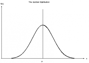
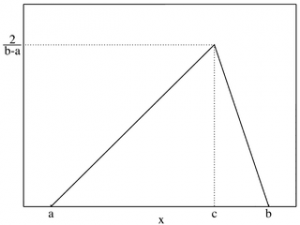
I believe we can do much better. The most common depiction of a probability distribution is as a curve, but this requires an extra graphical dimension and would add clutter. We can accurately depict a distribution without adding dimensions by rendering it as a cloud. Conceptually, we'll plot a horizontal bar that spans each height where the distribution has a non-zero value, and shade it in proportion to the probability density. In practice, this creates a rectangle whose opacity varies with height. Here are a few examples of this with normal, triangular, and uniform probability distributions.
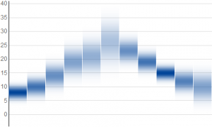

The distributions are distinguishable from each other at a glance, and their differences are visible without needing to learn what a box or whiskers mean.
Here are three plots of normal distributions with the same mean values but decreasing variance:
Notice that when the uncertainty of data is small, the results approach the horizontal lines from our first example with exact data values. As a math nerd, this continuity makes me happy.
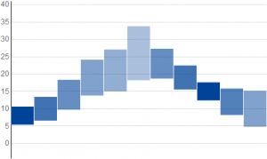
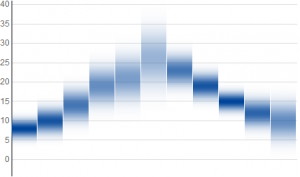
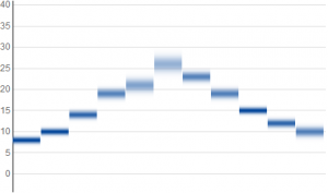
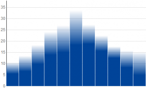
Applying the Concept to Bar Graphs
Now, if this is an uncertain dot plot, what would a bar graph look like? A data point in a conventional bar graph is represented by a bar that starts on the x-axis with full opacity, and ends at a height corresponding to the data value. If our "data point" is a probability density function, then for our uncertain bar graph we should plot a bar whose opacity goes to zero as we pass through the "data point". The way to express this mathematically is that the opacity should be equal to 1 minus the cumulative distribution function.
Below are bar graphs for the same data and distributions shown above - normal, triangular, and uniform. The differences between these are more subtle, because minor features such as corners in functions become even more minor when the integral is taken.


Visualizing Data Uncertainty with D3
I've built a web toy that lets you play around with everything discussed in this post. It has a couple sample data sets built in, but try entering your own data and see what it looks like. So, enough talk - go try it out yourself!
One thing you might notice about the exponential distribution is that the dot plot and bar graph look the same. A bit of calculus shows us that they are indeed identical. In the future, I think it would be fun to explore applying this to continuous-domain data, or to allow the user to enter observed values and watch the graph build the probability cloud around them.