

Increase Your Data's Reach by Overcoming These Common Visualization Challenges

It’s common for organizations and companies to post data to their sites in static form — useful facts buried within slides, reports, or infographics. These facts are integral to an organization’s message and analysis but this static approach can decrease a visitor’s ability to utilize the data to its full potential. We’ll discuss four common problems around this “trapped data”, as well as specific solutions that let organizations provide their visitors with greater insight into and control over the data.
Organizations that invest time and money into data collection or analysis understand that data retains its value long after its initial publication is forgotten. With a goal of spreading their message to as many people as possible, finding ways to solve inefficiencies in data dissemination is critical to them and to the visitors who rely on their data.
4 Common Challenges with Data Visualization
Here are four challenges we've identified around “trapped data”, along with ways to overcome them:
- Visibility: Important data gets buried among other content on the site and its value diminishes prematurely, as visitors can’t find it easily.
- Breadth: The amount of data that can be included in a report is reduced and only a fraction of the available data is presented.
- Presentation: While the static data is useful, it may not be presented in an optimal format (e.g., a map instead of a bar), requiring visitors to recreate it or utilize it at a lower potential.
- Portability: The desired chart or data point may be buried within a larger report, making it difficult to cite, share, extract, or embed.
Challenge 1: Visibility
Data in static reports commonly gets lost among other site content and ages too quickly. The data points cited within these static materials could continue to be useful for many years but once the document is out of sight, the data is utilized less often. To solve these issues around visibility, accessibility, and content longevity, organizations could look at creating customized data visualization sites, witha centralized administrative tool to house and manage data derived from multiple resources.
- This standalone site should be highlighted and accessible via a noticeable link on the organization’s existing site. This increases the prominence of data that would otherwise be dispersed among many static documents, creating a high-profile, evolving tool that organizations can market and point visitors to.
- Visitors should be able to search the site's data by keyword or location, or other parameters designed to help them search a database of hundreds of data points quickly.
- Visitors need to be provided with ways to navigate through the data using various methods (e.g., by location, by topic, by demographic group, or by data source).
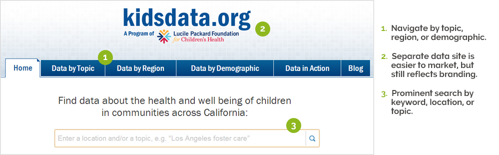
Banner, navigation, and search box from kidsdata.org
Challenge 2: Breadth
Static reports constrain the amount of data from the original dataset, that can be made available. This may be a result of various circumstances: constraints on staff, a lack of variety in how the data can be displayed (e.g., only tables or bar charts are used), or space/length considerations. Particular measures, cross-tabs, locations, or years may be suppressed, preventing visitors from getting the full story of the data.
To solve the issue of how to present a fuller complement of data, organizations need to utilize a flexible system that produces data visualizations based on logical structural underpinnings—locations, cross-tabs, timeframes, and other key fields. The system should support the following:
- Many region types, from common ones such as nations, states, counties, metro areas, and school districts, to customized regions relevant to a particular state or organization.
- Various timeframe types (e.g., single years, two year averages, or decades).
- Critical metadata that’s often not feasible to retain in static methods, such as margin of error, source, definition/notes, standard deviation, or other methodology details that can help increase the data's transparency and credibility.
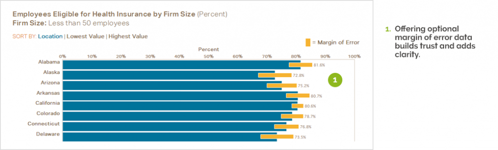
Bar chart, including margin of error data, from the SHADAC Data Center
Challenge 3: Presentation
Static data may not be presented in a format that best conveys the data's narrative. This is further compounded if users can’t see the exact data points. For example, a static line graph may not show each data point, preventing the visitor from obtaining specific numbers to cite in their own reports.To solve issues around accessing the underlying data points and customized views of the data, organizations must ensure that the front-end website offers useful and flexible options such as:
- Multiple chart types: Ranked Table, Trend, Map, Bar, Pie, and Scatterplot or other custom data visualizations
- Different ways to obtain specific data points: Revealing a data point on hover, offering raw data downloads, and including companion tables alongside visual charts are some ways of accomplishing this
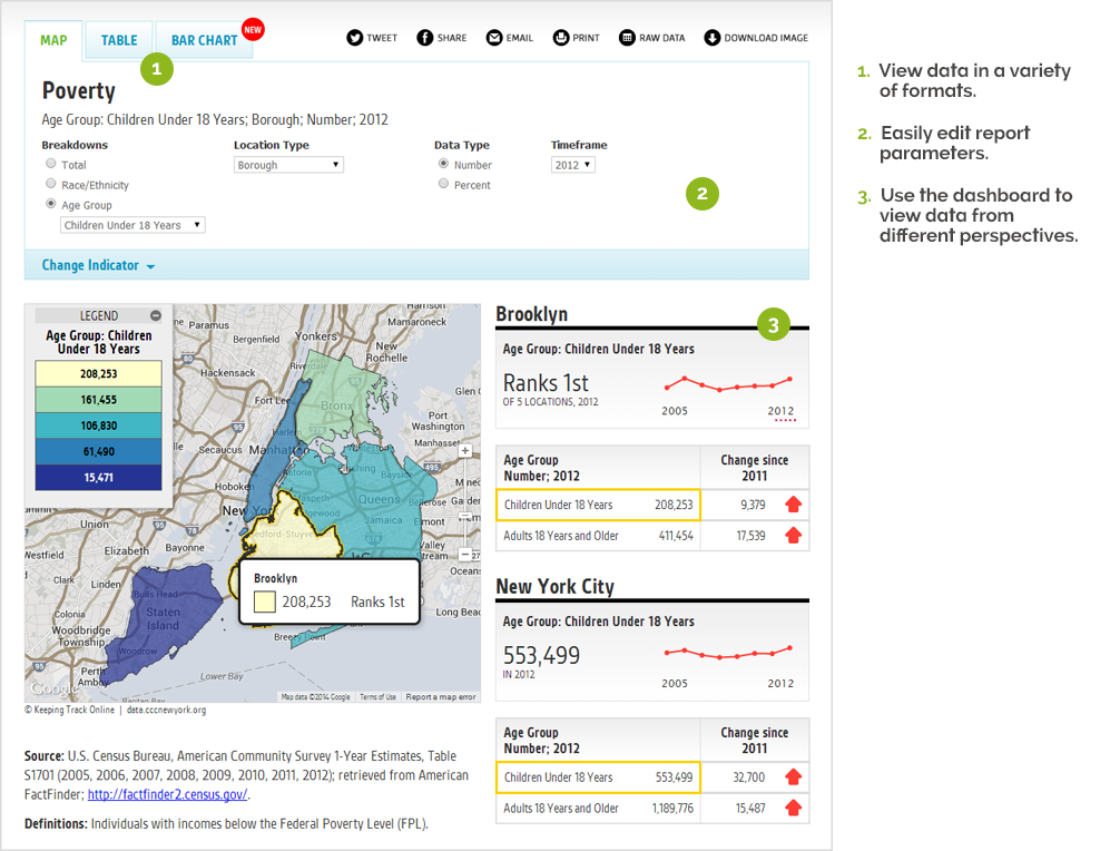
Map dashboard, including a Google map, rank, table, trend sparklines, and variation over time, from Keeping Track Online
Challenge 4: Portability
Static data buried within larger reports is difficult to share, embed and distribute on a personal level. To solve the issues around sharing and extracting data, organizations should provide their users with methods to output data in a variety of formats, so that it can be dispersed in efficient and meaningful ways. These powerful sharing tools encourage visitors to become partners with the organization, referencing and promoting the organization’s data—and ultimately—their message. Below are various distribution options that should be considered
- Integrations with Twitter or Facebook or other Social Media plugins for additional sharing tools.
- Print, Export as PDF, or Email the information contained in the data visualization
- Export as Raw Data for offline analysis or chart creation.
- Download a Static Image or Export to Word, PPT to create a report.
- Embed a data visualization with live data on a separate site (e.g., on the organization’s main site, on a blog, or other interested party’s websites).
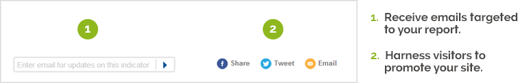
Email updates and social media sharing, from Kidsdata.org
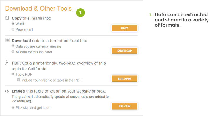
Copy, download, PDF, and embed tools from Kidsdata.org
Velir's Datacenter
Since 2000, we have solved these exact data visualization dilemmas by creating user-friendly data sites and a data management system, Datacenter, that can be used to present, store, and update datasets on a 24/7 basis. We’ve coupled this administrative back-end with customized front-end sites that allow the public (or members-only) to search, navigate, map, chart, sort, extract, and share the data in myriad ways. By creating sites that understand and support the specific needs of ‘data’ (versus other kinds of static content), we’ve provided organizations with a means to elevate their data’s prominence and influence.
Velir’s Datacenter is a proprietary data visualization platform that offers organizations a proven method for keeping their data available, relevant and useful. It provides the backbone for a powerful set of tools that can transform millions of data points into infographics, tables, maps, graphs, and charts. Datacenter comes with an intuitive interface that allows non-technical users to easily update data sets and create new data visualizations on the fly—promoting efficiency, customization, deeper levels of access, and varied ways of sharing content.
We’re proud to have partnered with organizations such as the Annie E. Casey Foundation, the Lucile Packard Foundation for Children’s Health, the Robert Wood Johnson Foundation, the Citizens Committee for Children of New York, SHADAC, and many others, to help bring their data to life.
Feel free to contact us if you'd like further information. I'd also love any comments below with your thoughts on maximizing the potential of data.