

Why You Can Stop Worrying About The Fold

As a follow-up to my last Velir blog post, a polite-ish takedown of the carousel as a tool for featuring content, I’m going to address one of the more pervasive remnants of the web’s early days: the concept of "the fold," which leads people in what-goes-on-the-homepage arguments to make statements like:
“My content has to go above the fold, so users will be sure to see it!”
What’s all this about? Why is this a terrible idea? Read on!
A Little History
The term “the fold” has its origins in the newspaper industry – content “above the fold” represents the content that would be on the top half of the page of a folded newspaper, and therefore, the most visible when papers are stacked up on racks or shelves to be sold. Similarly, above-the-fold content on a website has come to represent the content visible before a user begins scrolling down the page.
Room for One More?
As you can imagine, due to its immediacy, above-the-fold real estate on homepages and landing pages has become very valuable - the web equivalent of beachfront property, if you will. Everybody wants a piece.
But beaches get a lot less pleasant when they're overcrowded - and so do websites. If we had infinite room at the top of each page, we’d be able to put everything up there. Screens, though, are of a finite size, so if you try to load up the above-the-fold area, you'll find yourself doing one or more of the following:
- Shrinking everything down past the point of legibility
- Removing all negative space between items (and inadvertently implying relationships between unrelated articles or site sections)
- Displaying all the page's calls-to-action at once (ensuring that users don’t reliably click on the ones you think are most important - or most profitable).
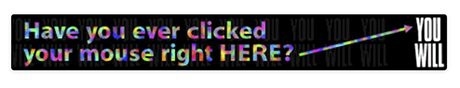
If you try to promote everything, you end up promoting nothing. Do any of the above, and you'll create a catastrophe of a user experience that fatigues and confuses users, e.g.:
Yikes.
So, something’s gotta give. Something’s gotta get pushed down the page. But what happens to this unfortunate content? Will anybody ever see it? Yes, fortunately, they will - because things are different on the web than they used to be.
The Game Has Changed
The web has evolved a lot since it first hit the public consciousness and so has web user behavior. Some then-and-now anecdotes can help us understand three major trends in web design and usage that have made the fold less and less relevant:
1. Skilled users start to replace inexperieced n00bs.
THEN: Twenty years ago, many users were new to the web and were overwhelmed with the variety of banners, links, and navigations available to them. They clicked on anything and everything. The world’s first banner ad:
had a now-inconceivable clickthrough rate of 44% (compare to 0.1% for the average banner ad)! In an environment like that, users got distracted or overwhelmed and clicked on links that led them away from below-the-fold page content long before they scrolled down to it.
NOW: In 2014, many users have been using the web for decades. Americans, on average, now spend more time online than they do watching television. This kind of experience breeds expertise: people are capable of navigating down a page for the content they really want instead of clicking on the first link they see.
2. The web becomes more structured and easier to read.
THEN: Inconsistent practices, new technology, and a sort of frontier mentality made web 1.0 visually fragmented. Each page demanded a high mental effort from each user (inexperienced users, remember) to discover and adapt to where content and navigation items were placed. Companies and organizations often had to convince their boards of the value of even having a website at all. Chaos reigned!
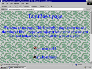
Whoa dude.
NOW: A generation of web designers and developers has grown up and brought some consistency and convention to the web. Groups like the W3C and Mozilla have now been working for decades to increasingly standardize browser performance and expand upon the capabilities of HTML and CSS - and best practices for navigation, content organization, and readability online have evolved, making sites more usable. Brands and organizations take the Internet seriously and dedicate resources towards professionalism and clarity online. In an environment like this, you don’t need to cram all the content at the top of the page so users will read it, quick, before they get distracted or their head explodes - you can space it out and allow a readable flow of information to guide a user down the page.
Much better.
3. Scrolling becomes a natural action.
THEN: Remember this guy?!
Clunky but classic!
Way back in the 90s, users had to navigate the cursor to the scroll bar and click precisely on a not-very-wide area, or move back to the arrow keys on their keyboard, to scroll down a page. This wasn’t very efficient or enjoyable!
NOW: Technology advances allow scrolling to become second-nature on the web. Remember how excited we all were when this gamechanger came around?
The almighty scroll wheel.
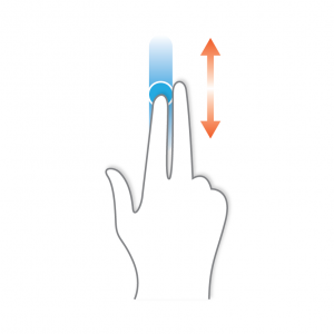
What about trackpads that support scrolling like this?
Or, even more dramatically, smartphones, whose screens are so small there’s no way to use them at all without scrolling? In 2014, we’re flush with devices that make scrolling easier and more natural than clicking - after all, it’s just a continuation of what you were already doing: reading down the page.
Some Supporting Research to Prove That This Isn't All Just Like, My Opinion, Man
Research shows that users aren’t afraid to scroll. We can go way back to December of 2006 (a full six months before the release of the original iPhone) and find data showing that in a large-scale test, 76% of users scrolled. 22% even scrolled all the way to the bottom, which may not sound like much but it is and most of the users who dropped off before the bottom probably did so because they found what they were looking for, not because they got tired of scrolling.
Other studies show similar data, including this one which suggests that having less content above the fold is an effective way to encourage users to scroll to below-the-fold content. Fundamentally, it turns out that all you have to do is simply clearly indicate that there’s more content below the fold - by avoiding scroll traps like component-specific scroll bars, or visual signifiers like thick horizontal lines that risk inadvertently looking like the end of the page - and users will happily scroll.
One Last Nail in the Coffin
If there’s any one thing I can add to really drive home just how irrelevant the fold, as a concept, has become, it’s this: the fact that the fold is imaginary.
What does that mean? Well, you may be familiar with the concept of responsive design - a technique that allows a website to reorganize the way its content is displayed, based on the size of the user’s screen, so it’s usable on laptops, tablets, smartphones, etc. Responsive design is the best way to cope with the rapidly increasing variety of device screen sizes, and the corresponding grim reality that a web designer can never be sure what size the user’s device is. What that means, though, is that a web designer can never be sure of exactly how much vertical space any given user has displayed on their screen. So the term “above the fold” starts to get a little vague when we can't even know where the fold is.
Now, this isn’t a new problem; monitors have always had different resolutions, going back to the when a 800x600 CRT monitor was state of the art. But the range of expected resolutions has gotten much wider in recent years, from hundreds of different smartphones to massive LCD displays. How can “above the fold” even mean anything in a world where some users’ fold occurs at about 300 pixels and others’ occurs at 2000?
Bringing It Back to Newspapers
So after all this, if you’re with me that users will scroll, that the fold is conceptually irrelevant because we don't even know where it's located... I have to confess, and I hope it won’t feel like a betrayal: the space at the top of the page is indeed the most valuable space on a homepage or landing page. I know, I’m sorry, it’s true, but - let me explain.
Let’s think about a newspaper again.

What’s actually up there, on the front page, above the (real) fold?
- The name of the newspaper, its logo, its motto
- Important contextual information like date, issue number, and price
- Generally useful information, such as a brief weather report
- Some short headlines for several recent news items, and corresponding instructions about where to find them deeper within the paper
- And, usually, the beginning of a few major stories that stretch beyond the fold.
Look closely, and you’ll see that even though newspapers do actually have a fold, they still aren’t trying to cram everything above it. They know that this space is for navigation - to help a user understand where they are and what they’re reading. It’s for context-setting. It’s for giving a broad perspective on what’s important to the publisher. It’s for convincing a reader to go deeper. It’s not for promoting every single item within the paper, or for giving each section of the paper a feature spot right on Page 1.
Think of your website in a similar way. Use that valuable space, where all users start, to help orient readers and to help them navigate through the depth of your content - not to try to display all of it at once!