The Advantages of Utilizing a Flat User Interface

What is Flat UI Design?
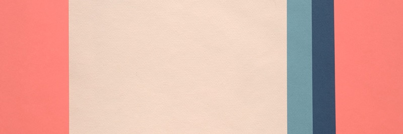
Flat design refers to a style of interface design which removes any stylistic choices that give the illusion of three-dimensions (such as drop shadows, gradients, or textures) and is focused on a minimalist use of simple elements, typography and flat colors. Some common conventions of flat design include:
- Use of bright color
- Strong use of grid systems
- Utilization of iconography
- Large fields of color
- Activated and integrated Negative space
- An emphasis placed on strong sans serif typography
- Clear, large action items
- Lack of ornamentation
"That's been one of my mantras - focus and simplicity. Simple can be harder than complex: You have to work hard to get your thinking clean to make it simple. But it's worth it in the end because once you get there, you can move mountains."
— Steve Jobs
Why Should You Utilize A Flat Style?
To be fair, every design project has its own set of challenges and a flat UI isn’t the best option for every situation. However, employing a flat UI offers benefits in many situations:
Aesthetics
One thing that will never go out of style is simplicity - whether it’s the ergonomic curves of a molded Bauhaus chair or the profile of a Coca-Cola bottle, there is a timelessness to simplicity that trumps passing ornamental styles. Designing your site with these philosophies in mind will help to align your business with a classic and enduring aesthetic.
In the world of web design, style trends come and go but flat UI has historical design implications that extend far beyond fickle fads. At a foundation level, flat UI embodies numerous philosophies in graphic design that have existed since the inception of the practice and simplification is at the heart of these ideas. By removing decoration in design you can emphasize what’s really important rather than superficial elements that detract from site content. In doing this you synthesize the goals of the site to the most clear and direct form.
"I strive for two things in design: simplicity and clarity. Great design is born of those two things."
— Linder Leader
Usability
Stripping ornamentation from design elements not only makes layouts cleaner and more visually appealing, it also increases the site’s usability and makes actions more clearly actionable. Users who are not distracted by unnecessary styling are more likely to engage with your site, resulting in an increase in usage and conversion.
Browser Compatibility
Flat UI systems, due to their simplicity, are often more cross-browser compliant. In any web project there’s always the possibility that a portion of users are viewing your site on outdated browsers. In some situations decorative elements controlled by CSS may be disregarded by an old browser – ultimately breaking the design. Removing these styles reduces the potential for incompatibilities. Using a flat UI also enables the use of icon fonts for iconographic elements, which are typically widely supported.
Responsive Friendliness
When dealing with small screen sizes, such as mobile displays, flat UI systems work wonders. Screen real estate is always in high demand at these scaled down dimensions and utilizing a flat scheme makes the most of the small space you have to work with. Removing effects like drop shadows and bevels may only save a couple of pixels here or there but those pixels can be invaluable when representing a complex site on a smaller screen size.
Wrapping-Up
The utilization of a flat style in a digital interface can de-clutter your message and bring focus to the goals of your site. It embodies the true intent of interface design – providing a compelling visual aesthetic that is simple, intuitive, and reinforces your content - making it a favorite among industry folks and a wise stylistic choice to consider for your next redesign.
Comment below on some of your experiences with flat UI design and favorite examples, or if you have any questions on the topic.


