

6 Web Design Trends to Watch Out for in 2015

2015 is off to a running start and exciting new projects and challenges lie ahead. We expect to see the web design landscape changing (as always) to keep up with rapid changes in technology.
In anticipation, Velir has put together a list of technologies, practices, and aesthetics that we’re likely to see more of in 2015.
Keep it Simple
Flat design didn't end up being another passing trend. 2015 is going to be a big year for de-cluttering in design and the reduction of visual complexity in favor of a simple reading experience. We’ve seen a lot of major brands transition their logo and designs over to a more flat aesthetic and that will most likely continue and become widespread.
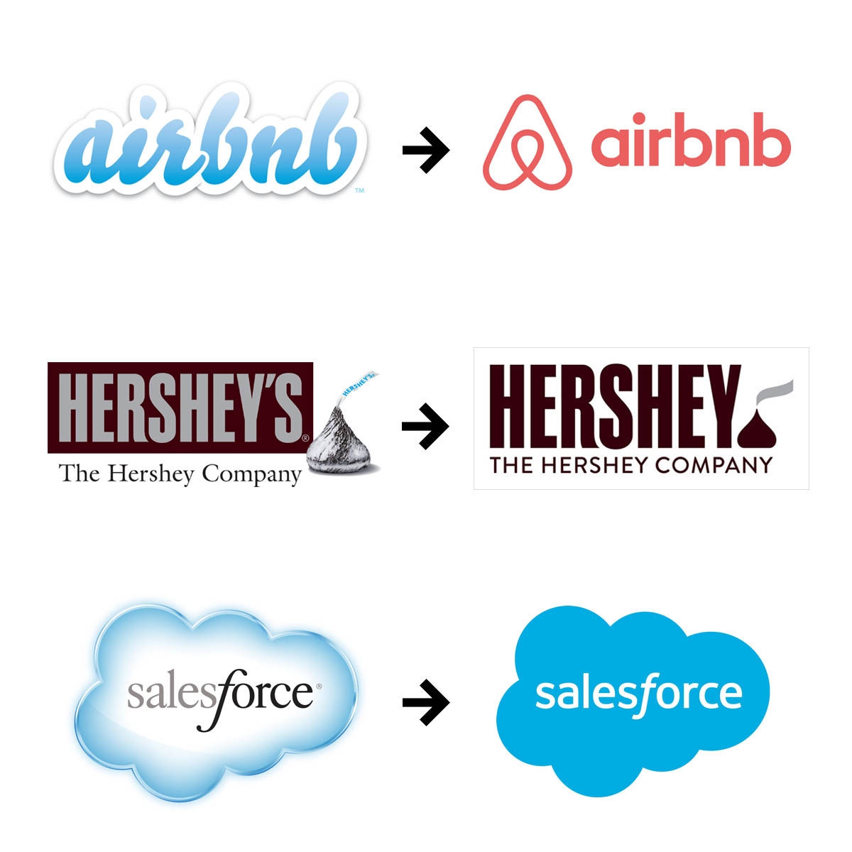
Brands that went flat in 2014
Another thing to note here is load speed. Hopefully, this will be the year that SVG images become a web design standard. They provide the benefit of crisp and scalable images that can still load quickly due to their smaller file size.
Tile-Based Web Design
Pinterest hit the nail on the head; their entire website is based on cards. Tile or card-based design breaks down your website's content into smaller blocks of information. Not only does it make designing for mobile easier but the content itself is more digestible for our rapidly decreasing attention spans.
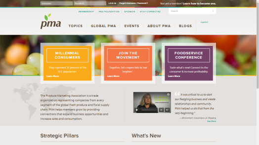
We used tiles for the Produce Marketing Association to help highlight and organize important information
Responsive isn’t Only for Mobile
Responsive isn't just a recommendation anymore, it’s a must for any website that wants to retain their mobile audience. 57% of consumers will NOT recommend a company with a website that looks bad on a mobile device. Pinching and zooming eat away valuable time and are frustrating and somehow, you always accidentally touch the ad that brings you to a download of Candy Crush.
Smaller screens aren’t the only thing to think about when it comes to responsive design. Desktop screens are getting larger and responsive design should work for them too (fun fact: everyone in Velir’s office uses 32’ monitors). We think we’re going to see designers overcome the whitespace you often see on big monitors and make their designs more fluid. Smashing Magazine is a great example of a site that takes full advantage of the increased real estate available at larger screen sizes, while Brilliant Earth is a good card-based example.
Scrolling Obsession
The great thing about a web page is that you have space - there’s no need to cram all of your content at the top of the page. Not only is this distracting but the internet has no traditional ‘fold’ anymore. Since mobile has taken over, people have become more accustomed to scrolling and they actually like scrolling (website visitors scroll on web pages 76% of the time —not too shabby.)
If you have a story to tell do it via a long-form scrolling page. The design concept is based on the idea that users don’t want to wait for pages to load and often, don’t know where to go next after a feature page. Scrolling also benefits you because you’re in control of the information they see rather than them clicking around to random pages and drawing their own conclusions.
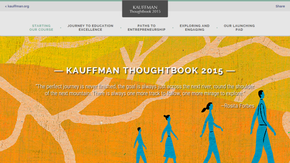
We recently transitioned the Kauffman Thoughtbook from print to digital and it is a scroller’s dream
An Emphasis on Typography
Since layout design has simplified, we may see further thought and creativity expressed through type. Custom fonts and pairings are popping up everywhere and should be a priority for every web design. Typography should always be a concern but even more so now that the widening screen variation is skewing proportion. When a font size doesn’t adjust to your screen proportionally it can cause eye strain and an overall bad reading experience. There’s a solution for this: responsive typography (go figure).
Microinteractions
Microinteractions are all about user experience. These subtle animations and moments can have a big impact on how your users interact with your site and ultimately, if they return for another visit. Dan Saffer, who wrote a whole book titled Microinteractions, said,
"When designs have a nice ‘look and feel’ to them then microinteractions are considered to be the ‘feel’ part"
— Dan Saffer, Author, "Microinteractions"
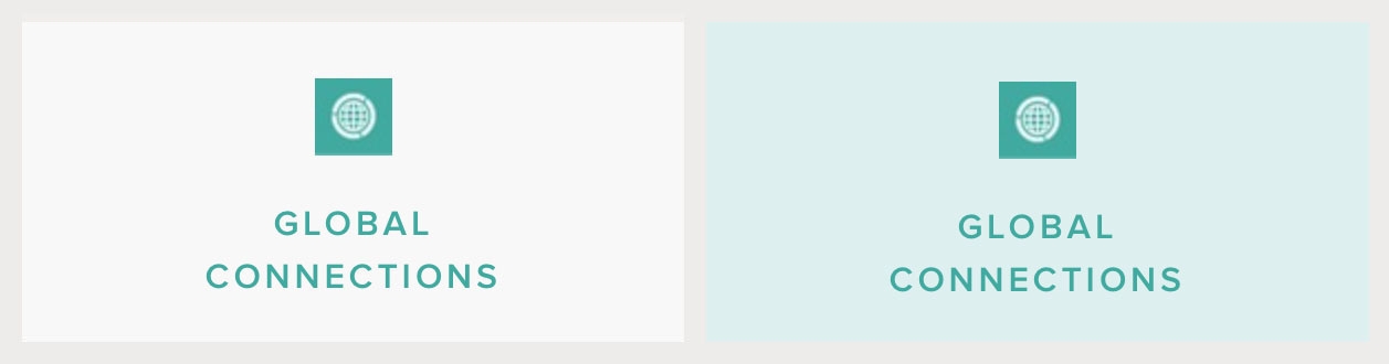
When the user hovers over this button it changes color to show that it’s clickable
Whether it’s an interactive button or the like button on Pandora, microinteractions enhance your experience without much distraction. Often, the difference between websites that we like and those we love are the microinteractions hidden in them.
All in all, web design is a thoughtful industry that takes the user's needs and interactions into careful consideration. This post is just a taste of what's in store for the future but it's clear were going to see continuously improving and sophisticated design solutions as the year progresses