

Prototyping: Why You Should Start Designing Websites in the Browser

One of the biggest challenges in web design is confronting the immense and constantly growing universe of device screen sizes (here are 286 common ones). Responsive web design helps us create websites that work on all screen sizes, but you still have to think carefully about layout and aesthetic design to ensure that functionality and appearance smoothly transition from mobile to tablet to desktop and anything in between. That can add up to a lot of time spent making static mockups.
An alternative to having designers spend hundreds of hours in Photoshop is prototyping. In this post, you’ll get an understanding of what prototyping is, why it’s awesome, and how Velir applies this technique during the design process.
What is Prototyping and Why Does it Work So Well?
Put simply, prototyping is wireframing and designing in code (mainly HTML and CSS) instead of static mockups.
There are many reasons this is beneficial:
- Prototypes aren’t static. Because they're built in code, prototypes are better at demonstrating responsive behavior that would otherwise require countless combinations of static screen images to represent.
- Prototypes are a more accurate representation of the way a website will really look and function. Your final website will be viewed in a browser, so it stands to reason that viewing your designs in code is more representational than viewing them as static mockups. For example, Typography often looks slightly different in code, and across various browsers, than it does in Photoshop or other graphic editing programs. This discrepancy can cause delays and confusion among stakeholders, who often expect code to be a pixel-perfect match to mockups. Not so with prototyping.
- Prototypes are a great way to catch potential breakpoint issues before they become real problems. Prototypes display different break points in-browser and demonstrate how features and functionality behave in different viewports. This provides an early opportunity to adjust component behaviors, rather than waiting until front-end development is completed. Modifications can be made quickly, saving time and money in the long run.
Our Prototyping Design Process
Sketching
We start with pen and paper. Sketching helps us quickly validate component and layout ideas before we dive into creating anything digitally. Sketches are quick to create, easy to modify, and most importantly, hard to become counter-productively attached to. What’s important at this early stage is speed and iteration, so sketches – which are low-fidelity and disposable – are a great starting point before embarking on higher fidelity, more time-intensive deliverables. This approach allows us to flag and address any major conceptual flaws before the prototype process begins.
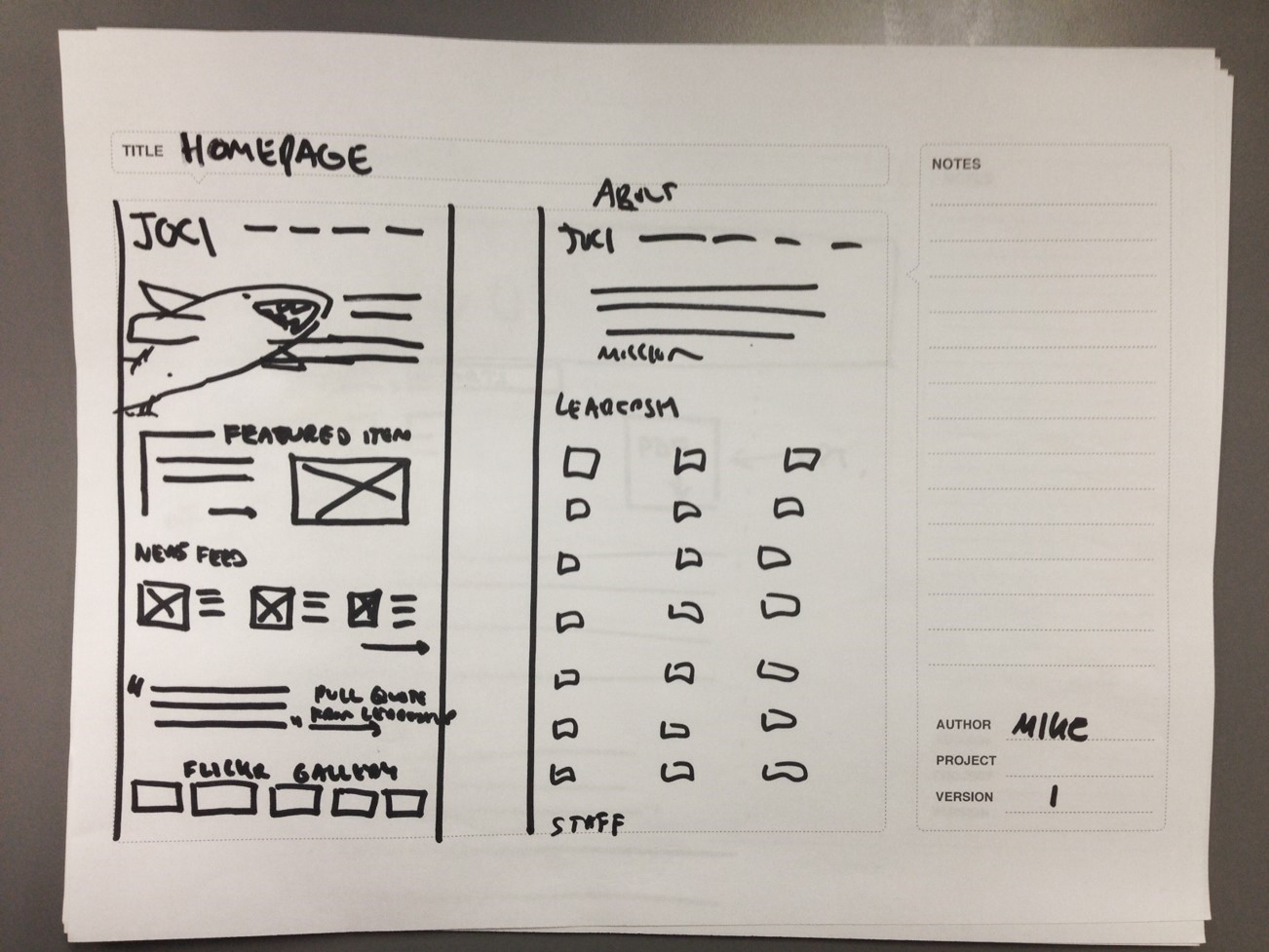
Low fidelity sketches are a great way to validate component and layout ideas
Grey-Box Prototypes
Once we’ve used sketching to produce rough page layouts and an idea of the features expected, it’s time to make digital wireframes. Traditionally, this would mean opening up a design program (e.g. Photoshop, Illustrator) or wireframing application (e.g. Axure, Balsamiq) but with a prototyping process flow, this is the point at which we start coding. We first build grey-box prototypes with HTML and CSS, following the standard principle of wireframing: display page and component layouts without being distracted by aesthetic considerations like typeface, color, etc.
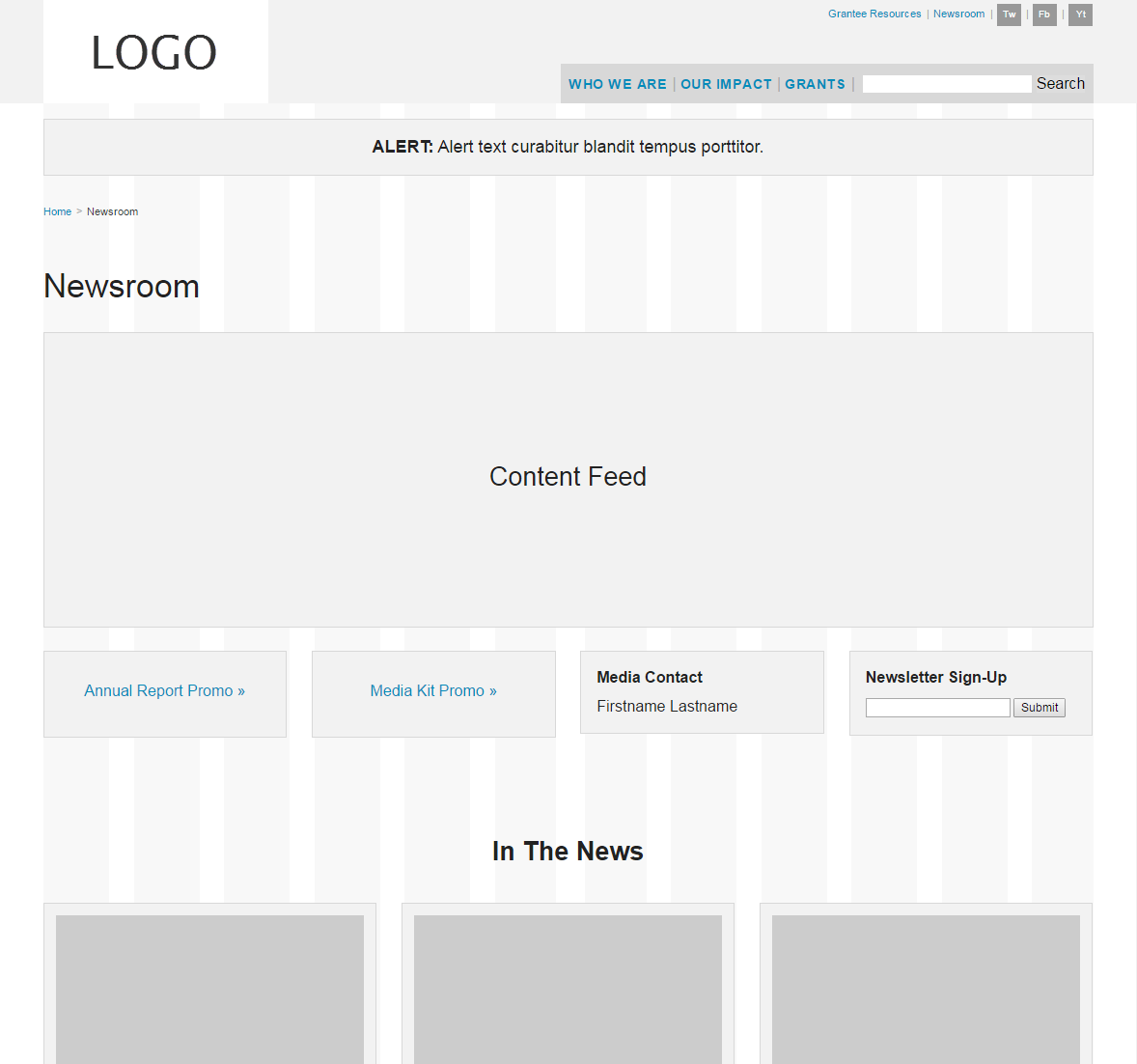
Grey-Box prototypes built in HTML/CSS demonstrate the layout of site pages and features
Grey-Box prototypes built in HTML/CSS demonstrate the layout of site pages and features. The code-based benefits of prototypes are apparent immediately: rather than mocking up individual examples at multiple breakpoints, the prototypes use responsive coding techniques (like media queries) to natively demonstrate variable behaviors at all screen sizes.
Style Tiles
While the "prototype developer" (usually a UX designer with code skills) is coding, the visual designer works on the site’s aesthetic using style tiles. Put simply, style tiles display the site’s visual elements (typography treatments, color palettes, button styles, etc.) and communicate the site’s look and feel without getting into layout or content considerations.
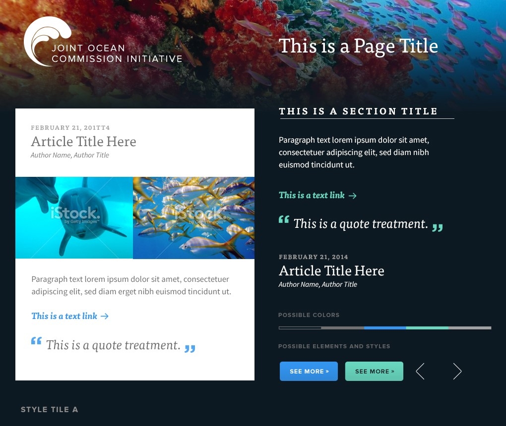
A style tile created for a recent client project
Design Prototypes
Once the style tiles and the grey-box prototypes are approved, the “prototype developer" works with the visual designer to apply the site’s aesthetic (from the style tile) to the existing grey-box prototypes, in code. This ensures that pre-approved layouts and behaviors look and perform as expected.
The final design prototype is then advanced to a more traditional development process and serves as a much better starting point than a large collection of layered PSD files. Front-end developers may now spend their time on thoughtful interaction design, performance optimization, JavaScript functionality, and adding finishing touches that make the site feel polished and complete.
So, What's the Catch?
The biggest obstacle to prototyping is the most obvious one: having the right skills available. Prototyping requires team members who can code to be heavily involved in the design process.
Ideally, prototyping is performed by a UX designer who possesses HTML/CSS skills and a solid understanding of responsive design techniques (in conjunction with layout and design skills). If you don’t have all these skills in one person, prototyping can still be accomplished via close collaboration between a visual/UX designer teamed-up with a front-end developer.
This might seem like a lot of extra time and effort. The good news is that we’ve found prototyping to be so much more efficient than creating static mock-ups. A two-person collaborative design/development partnership often fits within the same budget that would have originally been spent just on mock-ups. Believe it!
When Not to Prototype
Despite these advantages, there are instances when prototyping may not be applicable. If you’re adding a new feature onto an existing site and you’re already familiar with how that site’s navigation and other shared components work across breakpoints, you might not want to start from scratch to prototype the new feature. And with involved or complex interactions – a web application with a lot of JavaScript – jumping into coding might not be appropriate at such an early stage in the project.
The prototyping process also doesn’t necessarily need to be employed for your entire site. If you’re prototyping a site that has one particularly complex JavaScript component – would either take too long to code during the design phase or is beyond the skill level of your prototyping team – there’s no reason why you can’t prototype everything except that component, use a blank grey box to represent that component, and do multi-state mockups outside of the browser for that one component. You’ll still be prototyping for the rest of the site, and you’ll still save time overall.
Remember: A Prototype is NOT a Website
Neither prototypes nor final designs are the final product – the website is. The goal of any design process is to serve as an enabler to get you to the final product efficiently and clearly. Use whatever techniques are most effective for you, your team and your project! When used appropriately, prototyping is a great tool for creating and showcasing a responsive site’s user flow and interactions in a way that static designs often struggle to convey.
Drop us a line if you’d like to talk more about prototyping, or feel free to share your experiences in the comments section!