

Refreshing the Online Presence for a Popular Food Delivery Service

When looking to flex their chops in-between projects, members of Velir’s design and UX (DUX) team occasionally tackle real-world UX/UI/design issues on well-known sites or applications. Our senior interactive designer, Sarena Douglass, recently took a stab at improving a menu page in the web app of popular food delivery service, Foodler.
When hunger strikes and the prospect of cooking seems too tedious, many people inevitably turn to such delivery services to provide them with a list of restaurants from which to satisfy their needs. Foodler has some stout competition in this niche (Grubhub, Seamless, Eat24 come to mind), so providing users with the most convenient path to consumption is paramount to obtaining repeat customers.
Diving into her UX audit, Sarena uncovered three primary areas of improvement:
- Menu category placement
- Weak visual hierarchy
- Noisy, unintuitive UI
Issue 1: Placement of Menu Categories
While the general process of ordering food is familiar to most, each site has its own way of presenting different menu categories. Foodler opts to place everything in a list view along the left rail of the page, and the dishes in the main content well filter to display these results once clicked.
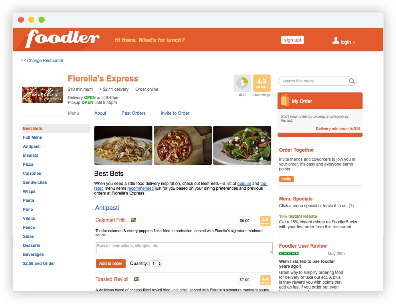
Menu categories in the left rail may give the impression of outbound links and take up valuable screen real estate.
However, it’s possible the categories don’t receive the attention they deserve. Choosing to use the left rail not only takes up valuable screen real estate, but has also been shown in various studies (most prominently a Nielsen Norman eye-tracking study) to be ignored by the majority of users.
The revised design places the menu in an easily navigable dropdown, while also incorporating other related elements that were dispersed throughout Foodler’s page (search, past orders, etc.). The result? The eye is now drawn to the center of the page, and food itself can be better showcased with larger thumbnail images and text.
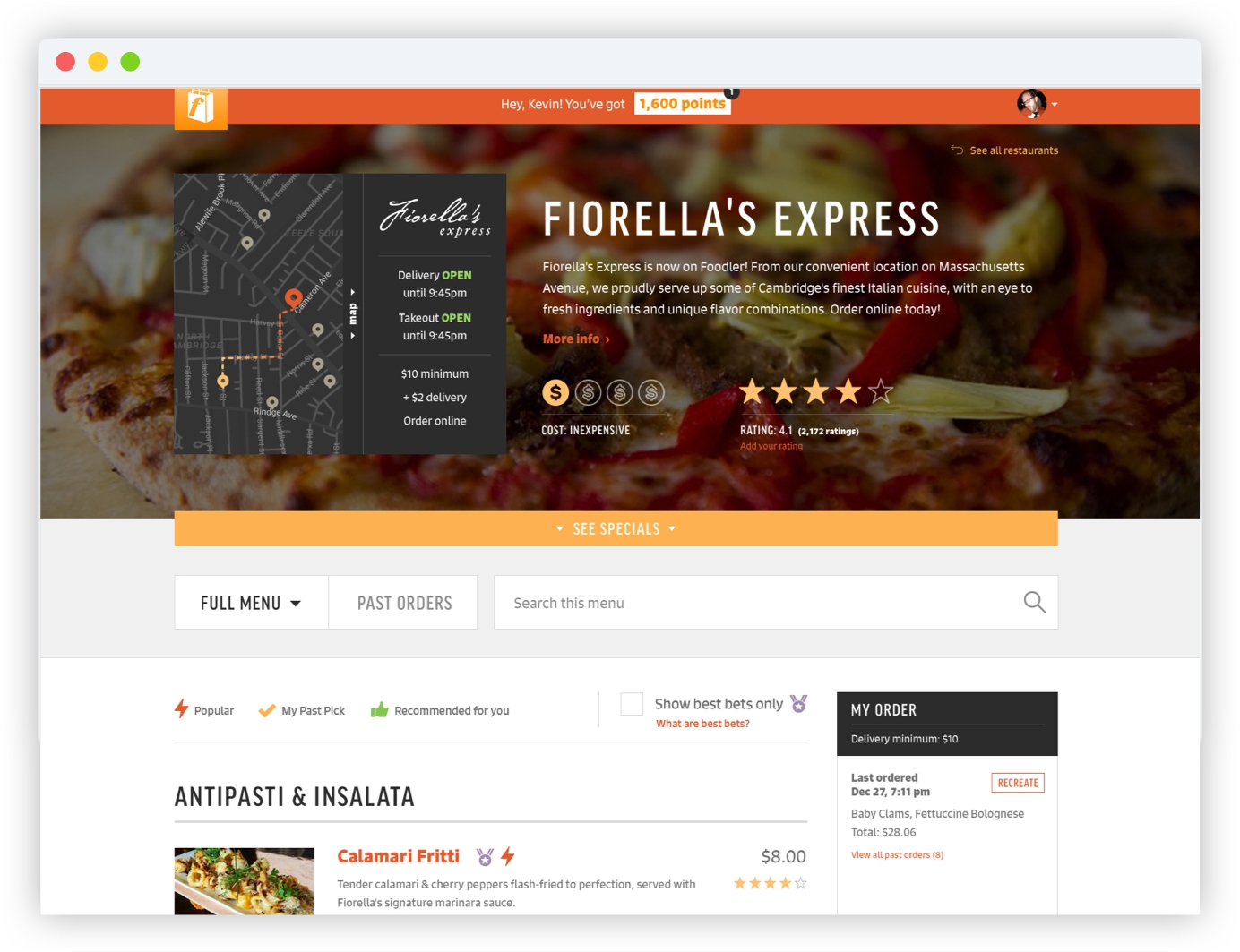
Placing menu categories in a dropdown frees up space for menu items. Also, more clarity is created by designating a section for icon keys and grouping like elements together.
Issue 2: Weak Visual Hierarchy
A sound visual hierarchical system on a webpage guides users from one element to the next, creating intentional contrast, so that everything isn’t vying for their attention.
Foodler’s hierarchy isn’t as clear, as they choose a neutral typeface (Arial) with minimal distinction in size and weight between different content elements. They use color to create a moderate level of differentiation, but this color scheme isn’t applied consistently, which arguably creates more confusion than it removes. Both blue and orange-colored text act as links in certain areas on the page, yet some orange headers in the sidebar are not clickable.
Compare this to the revised designs, where everything is bigger, bolder and more distinct. Users knows where to look first - the full-width hero - which contains most of the information they want to know at a glance (location, hours, delivery minimum, rating, and cost). Much of this is already featured near the top of Foodler’s page, but as indistinct plain text, with some elements - like rating and cost - not aligned with anything else on the page, creating disharmony.
A “hero” area is designed to provide a central space for company information and ratings, as well as creating a more modern aesthetic overall.
Furthermore, when subjected to the blur test (a quick way to determine the strength of a page’s visual hierarchy), the majority of Foodler’s page appears flat, with a few orange CTAs protruding. The revised design features more noticeable areas of demarcation, as menu headers receive a dark, bold, uppercase treatment, and the dishes themselves are bolder, larger, and better contrasted with the description below.
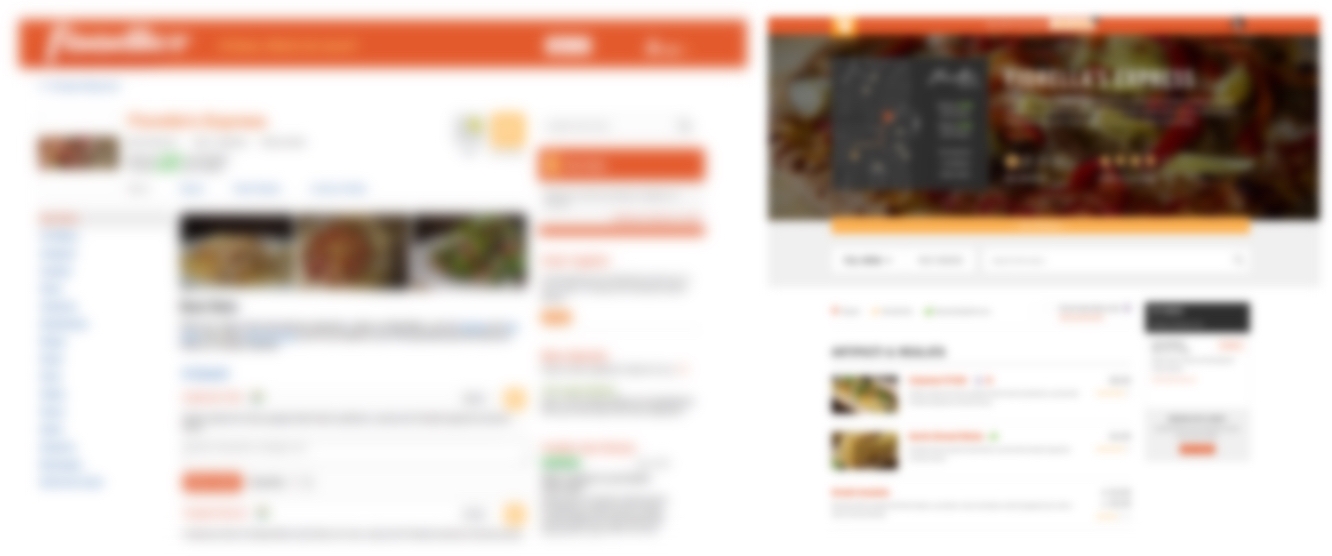
Setting a blur to your page designs offers a stripped-down look at your visual hierarchy, allowing you to evaluate the prominence of your CTAs and other interface elements.
Issue 3: Unintuitive UI
When crafting a site’s UI, usability and aesthetic appeal must both be taken into account. Users may perceive a sleek-looking page to have better usability (it’s true), but if the UI doesn’t align with their mental models, disregards conventions, or is generally confusing, it’s likely that most users will ultimately abandon the site for something that works better for them.
A few elements of Foodler’s UI raise some red flags:
- The aforementioned left rail of menu categories with links that reload the page on click, briefly jolting the user.
- A horizontal list of inline links above the menu items that act like tabs.
- A right rail containing a cart, a redundant link to invite others to join in on an order, and a review of Foodler itself that seems out of place and doesn’t add much value to the page.
- Buttons that don’t differentiate enough from each other, resulting in the entire page being very one-note (read: orange).
Generally, it’s preferred to keep a site’s signal-to-noise ratio high, placing only the most necessary elements on the page to avoid distractions and guide users toward their goal. As UX consultant Paul Boag bluntly states,
"People don’t care about your app or website…instead of trying to maximize engagement with users, minimize it. Start thinking of yourself as a utility rather than a destination."
— Paul Boag, UX Consultant
The revised design achieves this by nixing extraneous information (via a streamlined menu dropdown and decluttered right rail including only a cart), creating button hierarchy with the addition of an outlined treatment, and generally allowing users to focus on what they came here for - the food.