

Top 4 Steps You Can Take to Build WCAG-Compliant Website Navigations

Everyone navigates websites in different ways. Physical challenges, even personal preferences, affect the way in which someone traverses a site. Taking the steps to make sure that your site is accessible for screen readers, alternative pointers, and other assistive devices enables a larger set of people to access and use your site.
Accessible navigation is not just something that is nice to have, it is a legal requirement for governments as well as all organizations that are required to comply with Title II or III of the American Disabilities Act (ADA). Fortunately, ensuring that your navigation is WCAG 2.0 AA compliant is easier than you think, especially if it is set up from the get-go. With a little training, your team can continue to maintain these standards as they add or change features.
One of the first things to do is understand how people navigate your website so you can provide alternate options for screen readers and other assistive devices. Let’s dive into that in more depth.
Understand How People Navigate Your Website
Navigation – hamburgers, fly-outs, mega menus, footer menus, sidebar menus, breadcrumbs, and others – matters for usability. So, the amount of time spent on menus and navigation structures should be reflective of their impact on the overall user experience.
Most of us spend enormous amounts of time online and we tend to have a pretty good handle on how sighted people navigate – there's a general flow to how eyes move (depending on a language’s directionality) and certain things catch our attention due to size or placement. However, assistive technology users navigate in completely different ways.
Screen readers offer several ways to navigate a page.
An afternoon learning to navigate by screen reader can be a real brain twister; it’s nothing at all like visual navigation.
A big hero image is going to feel a lot like a smaller inline image to someone using a screen reader, but the order, nesting, and text content of heading tags may catch their ear as they zip through the page.
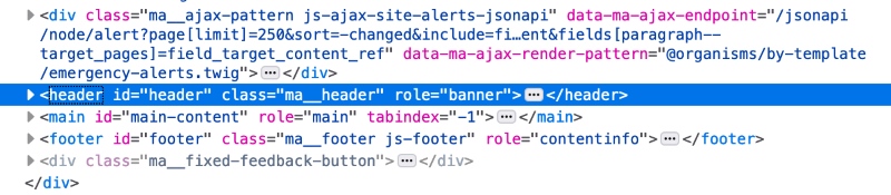
The most familiar non-mouse navigation method to sighted users is the simple focusable-item to focusable-item tab behavior using a keyboard. However, readers can also navigate from heading tag to heading tag, by line, by paragraph, or even by letter. Several assistive tools also navigate by landmark. Landmarks are tags like <main>, <header>, <footer> and <nav>—they tell machines that read your site more about its structure. Landmarks are also valuable for SEO.
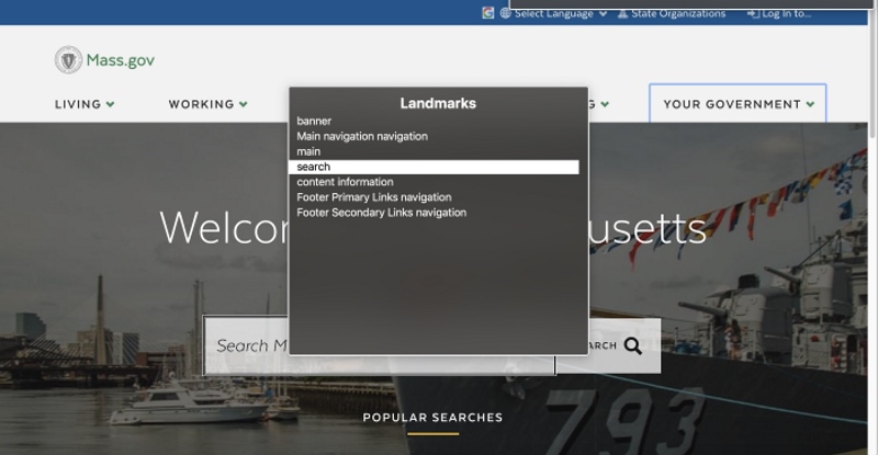
Apple VoiceOver is one of the tools that allows users to navigate by landmark.
Now that we know the basics of how assistive technology works, let’s look at steps you can take to make your navigation accessible.
# 1: Use Semantic Markup
Semantic markup allows for important parts of your page to be programmatically identified. This means that search bots can read your site, but also ensures that people who use assistive technology can quickly pick and choose which portion of the page they want to go to, all because the technology itself was able to read and segment the page logically.
One of the easiest but most important things you can do is to wrap your menu in navigation tags: <nav></nav>.
You can make it even better by giving your menus an aria-label if you have more than one and adding <main>, <header>, and <footer> to help assistive technology users pick the nav they want. An aria-label is an attribute used to define a string that labels the current element in cases where a text label is not visible on the screen; it can be used by screen readers for navigation.
Semantic markup provides landmarks that a machine can read and then offer to a site visitor as a way of navigating.
# 2: Provide Multiple Ways to Navigate Your Website
When one way of doing things is challenging for an individual, having multiple options to choose from means the difference between success and failure.
WCAG 2.4.5 Multiple Ways requires that you provide multiple paths to any given page. Most of you don't need to do anything to achieve this – your site likely already has a search that fulfills this requirement. For larger sites, a site map would work; for small sites, links to all other pages from the home page is an option.
One way to take it a step further? Include more than two ways (such as a sitemap, search, and breadcrumbs).
# 3: Add Skip Links
Don’t make reading your content a grind for individuals navigating your site via linear input devices (like the tab key). Before every long list of links, include a skip link that’ll take them past the list. Don’t forget to use it in front of carousel features, decorative items, or before long lists of search filters and facets as well. At the very least, your main navigation should come after a link to the main content of your page. You can even visually hide your link, so it doesn’t appear for those that navigate with pointing devices.

Skip links can be visually hidden — and shown on focus — to allow them to appear for only those who need them - i.e. screen reader and alternative pointer users.
# 4: Optimize Your Website’s Focus States
One of the first things people often tear out of their sites are the focus outlines on buttons, links, and form fields. However, focus states are vital for people with low color vision or those that use alternate pointing devices. Without a visible focus state, it's impossible to know where you are on a page if you're not using a pointing device to navigate. Long navigation menus make this even harder – lose count and you’ll need to go back to the start and try again.
So, add focus states on all focusable elements using CSS :focus – and make them beautiful. There's no reason to settle for Chrome's blue glow or the other browsers' poor-contrast outlines. Use bold underlines or CSS scale, and really own those focus states.
Want to take it to the next level? Make sure your focus states incorporate both a change in color and a non-color design element.
Underlines on focus make it clear that a link is currently active.
Best Practices for Optimizing Accessible Navigation
Accessibility is often the forgotten sibling of the web design family, but you could have many visitors that require your sites to be accessible. Ensuring that your site has an accessible navigation helps with making your site available to a larger audience, improving your SEO ranking on search engines, and protecting your company from costly lawsuits and penalties.
If you’re considering a redesign, it’s important to know that the agency you’re working with is well-versed in accessibility so they can implement accessible navigation on your site and train your team to maintain these standards over time.
In Part 2 of this series, we’ll delve into additional steps and best practices you can follow to make your website’s navigation more accessible.
If you have any questions about how to go about implementing the steps above or improve the overall accessibility of your website, we’re happy to share our insights and answer your questions. Join the discussion by commenting below or reach out via twitter or email.