

Using Multilevel Navigation to Meet Accessibility Standards

Creating websites accessible to people using screen readers and other adaptive devices has always been important, but it has become essential in the wake of Coronavirus (COVID-19) as many in-person interactions must now take place online. Your organization's website has to do more heavy lifting to minimize the need for in-person assistance and serve all your audiences fairly and effectively. In many cases, not meeting accessibility standards can garner lawsuits, fines, and bad publicity. And while avoiding those pitfalls is smart from a financial perspective, creating accessible websites makes good business sense because it shows all of your audiences that you care about them.
In Part 1 of this post, we covered the basics of accessible menu navigation. In this post, we dive into the specific area of multilevel navigation.
Multilevel Navigation for Content-Rich Websites
Typically, content-rich sites that have hundreds or thousands of pages on a site require an elegant way of nesting content so that layouts are clean and intuitive. In order to do this, you need to use multilevel navigation.
Multilevel navigation, with flyouts or accordions or any number of other methods for showing additional levels, is so common, it's the default for what you may think of as a menu. Even though they're common, multilevel navigations are also often created in a way that makes them inaccessible if you’re not approaching the menu with a mouse and good vision. A lot goes on in a menu, and context, behaviors, and readability can all be major issues.
For example, every developer’s first instinct is to use a hover at the second levels. But, how do you trigger hover from the keyboard or other non-pointer device? Enter? If so, then what opens the parent link? Double enter? Is that intuitive? What about mobile? As you can see, hover creates more problems than it solves, and not just for accessibility, but also for usability.
So how do you fix this? First, it’s important to know that there are certain expected behaviors for specific keypresses in keyboard navigation. Knowing this will help you plan your menu behaviors.
A typical multilevel menu will have several things that need to happen:
- A way to follow links
- A way to show child links that are hidden initially
- A way to move through links
- A way to close the menu
We’re familiar with how all these things happen with pointer navigation – click, click/hover, move your pointer around, and click/hover outside the menu, in that order. But how do you make that work for the keyboard?
- Following links is easy – hitting Enter will do that for us.
- Showing child links is trickier since you want to avoid hiding behaviors behind a double Enter or some other unexpected action. To solve the issue of a link with children pulling double duty as both drop-down trigger and link, you can add a button (this shouldn’t be a link) beside the link (a down carat or a +; make sure it’s big enough to tap and has an aria-label clearly explaining what it does) that acts as the drop-down trigger. Or, you can wrap the text itself in a button to use as the drop-down trigger and move the link into the dropdown.
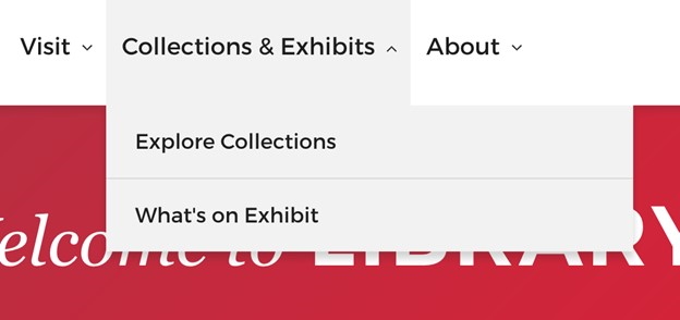
This can require some skill in naming. For example, the Harvard Library’s “Collections & Exhibits” trigger opens out to show a link to Collections and a link to Exhibits. Both of these methods have the bonus feature of working well in touch devices as well, and you can write the code to open the trigger via Enter and Space, as well as potentially the down arrow or left arrow as appropriate in the context.
- Moving through links can be as straight forward as retaining tab behavior (typically in accordions, or when simply always displaying all links) or as complex as adding up and down arrow behaviors to move through lists of child links. What’s important here is to remember expected behavior. If you’re curious about typical keyboard menu behavior, try using a native menu in your operating system of choice – this is what you’re trying to emulate.
- Closing the menu is actually pretty easy as well – just make sure Esc is wired up to close it up and move your focus back to the trigger.
Announcing a Menu
Think about how you know a menu is a menu when visiting a website. Iconography, location, orientation – all these indicate the presence of a menu. Now consider the same site from the point of view of someone using a screen reader. How can they know that a menu even exists?
In Part 1, we discussed about using landmarks to make it clear what certain parts of the page did, and that header, footer, aside, and nav are all used in conjunction to make it clear that navigation is there and easy to find. But what about the multilevel menu’s child links? There’s no way to tell that the triggers are anything but a button with text without a little additional work.
Because of that, you need to find a way to describe to an individual who can’t perceive that a menu is a menu, that there is something more hiding beyond the trigger. The Web Accessibility Initiative's Accessible Rich Internet Applications specification (WAI-ARIA) provides the key. ARIA attributes exist specifically to add semantic context to the page, and include options for a number of interactive elements, but the two we’re interested in for menus are aria-haspopup and aria-expanded.
Aria-haspopup makes it clear that activating the element it’s on opens something – like a submenu, or a hamburger menu. Screen readers will read these items off as a pop-up, and depending on the value of aria-expanded, will tell if it’s currently open or closed. Clearly, this takes some Javascript to manage, but since most of today’s menus already involve scripting in some manner, it’s generally a quick add to toss the appropriate aria values on there while you’re opening and closing the menu. As a general warning, be careful of ARIA – a little goes a long way.
Navigation on Mobile Using Alternative Devices
Believe it or not, your mobile hamburger menu (and all other menus) need to be keyboard navigable too, but not navigable by the on-screen keyboard as that would be odd. Instead, mobile users use plug-in alternative pointing devices that behave a lot like a keyboard, so the expected behaviors are much the same as mentioned above.
Successful Implementations for Wider Adoption
Multilevel navigation that is accessible to users on all devices including assistive technology is critical to meet accessibility standards. Meeting accessibility standards goes beyond merely avoiding fines and punitive damages; it opens your website up to a larger audience and indicates that your business is user-centric, creating solutions to make accessing your site easier and more effective to everyone.
Looking for more tips on how to make your website accessible? Read more of our thoughts on accessibility, or reach out to learn more about how we can help you build an accessible website.