

Crafting a User-Friendly Solution to Drive Content Decisions
Overview
A global healthcare company that supplies insights and resources to the industry needed an easier way to view website analytics so they could make data-driven decisions. They asked Velir to find a single, user-friendly way to view the data it needed to optimize its content and to make decisions about what to publish. Through workshops with key stakeholders we determined the crucial data points for measuring success on the website based on the client’s organizational goals. Using that information, we built a comprehensive, easy-to-use dashboard, which consolidated 25 Google Analytics reports, automated data collection, and gave the client a fast way to extract key insights.

Challenge
This organization needed a way to easily view data about its website so that it could make data-driven decisions. They struggled to find relevant data within the various reports in Google Analytics and lacked a singular, user-friendly way to view the data it needed to make optimization and content-driven decisions.
Their key challenges were:
- Navigating reports within Google Analytics to mine insights
- Building self-service website reporting to make data-driven decisions
Approach
We decided to create a comprehensive, easy-to-use dashboard for all the organization's reporting needs. We started by running workshops with key stakeholders to determine the most crucial data points needed to measure website success. These workshops gave us more insight into the process and inputs around decisions like new or updated content, features, or messaging. Our workshops ultimately provided the input and alignment necessary to understand their decision-making process around content and website updates. They ensured we could track progress against the company's business goal to improve content access on their website through improved user experience.
The crucial insights the organization would need to draw from its dashboard were:
- When to publish or update content
- When to create new features
- Which messaging resonates with audiences
Solution
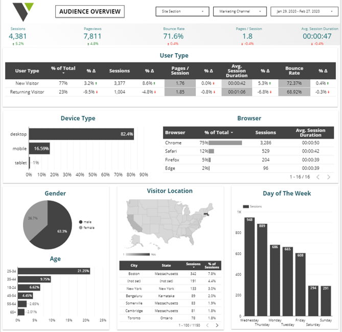
We used insights from our workshops to deliver a Google Data Studio dashboard with detailed charts analyzing audience demographics, acquisition sources, user behavior, and KPIs directly from this client's measurement plan. The dashboard dynamically refreshes data and empowers the organization's marketing team to pull their own reports with user-friendly filters to ensure the correct data is analyzed. This allowed them to avoid navigating multiple reports within Google Analytics and instead find the data they need in one centralized place. With digestible data at their fingertips, the organization's marketing team can make targeted decisions around their marketing and content.
Results
- Consolidation of 25 Google Analytics reports into one self-service dashboard
- Updated data collection that changed a slow and manual process into one which allows for easy extraction of impactful insights