

Using Technology to Show the Impact of Policy on Healthcare
Overview
Velir partnered with the Yale School of Medicine’s Center for Outcomes Research & Evaluation (CORE) to visualize data and communicate national healthcare outcomes by building their interactive CMS Hospital Chartbook site. The resulting site has generated thousands of visitors from multiple countries, who download and engage with its data.
URL

Challenge
In 2010, The Medicare Hospital Quality Chartbook was created to share measurements around mortality, complications, readmission, payment, and EDAC. As the adoption of digital tools in the medical community increased, the need arose to translate this report from its original format into an interactive online tool for both CMS and the greater public to use. Ultimately, we wanted Chartbook to allow easier access to the data that drives decisions about the overall quality in hospitals.
CMS and CORE's key challenges were:
- Converting an analog, non-digital report into a compelling digital platform
- Building interactive data visualizations that can generate custom reports
- Establishing a platform that's scalable and easy for content authors to use

Approach
We began with a series of planning sessions, UX workshops, and design sessions to understand the available data, and to envision what the platform would look like. We knew that we not only had to provide a platform for data visualizations, but to also create a place for experts to explain the process, link to briefs, and provide context around the project.
Because of the ever-changing nature of healthcare data, the data sets powering the visualizations also needed to be easy for CORE content authors to update. We used Drupal 7 and ReactJS to power complex visualizations from single CSV uploads.
Our approach included:
- Planning collaboratively with CORE
- Sketching and designing pages and visualizations to represent data and website functionality
- Developing the platform based on the requirements and designs gathered in earlier project phases
- Building the site with Drupal and ReactJS to power visualizations from CSV data
Solution
The outcome of our project was the Chartbook platform, an interactive, data-driven website that visualizes data and focuses on:
- Comparing hospital peer groups
- Payment measures
- Trends such as national rates over time
- Social risk factors such as state-level disparity
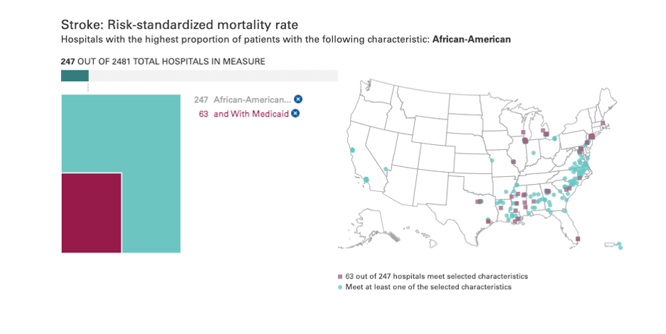
Data also showed inequalities based on hospital characteristics and social risk factors. By allowing audiences to narrow visualizations by specific risk factors, the visualizations spotlight these inequalities.
Results
- Deep engagement: Over 3 minutes spent on the site on average and a consistent bounce rate below 10%
- A global audience: Thousands of visitors from over 10 countries view Chartbook data