

A New Way to Create & Integrate Graphs & Maps into Websites & Social Media

Facts, as we’ve learned through our social sector data storytelling work, often deliver the most punch when they’re timely and released as an issue is getting public attention, which in our Twitter-fueled media environment often means publishing in a matter of hours or days, not weeks.
In our work, however, we’ve seen that being nimble with data can be challenging for our clients. Even when data are readily accessible, the ability to quickly visualize findings and to efficiently incorporate these visualizations into editorial workflows—a content management system (CMS), social media channels, even Excel—can be a tall order. So, we set out to help our clients overcome this obstacle (that is, the need for speed with data visualization). We wanted to help clients more effectively leverage data to make a persuasive, timely case on issues of importance to their work.
For example, a client may want to publish a blog post to provide insight on an issue making news for which they want to add charts to help make their point clearer with data. Or perhaps it’s a regular feature providing the monthly data pulse on a topic that they put on their home page in order to get out in front of an issue.
That’s easy enough, in theory. After all, there are off-the-shelf data visualization tools that make it possible to embed charts into web pages.
Very true, but here’s the catch: We’ve learned from conversations with clients that they often want something highly customized—the graphs to look a certain way, with typographic elements or branding that aligns with a website’s styling; or the interactions to perform certain functions, such as pop-ups on a map that include customized information appearing in the hover box. Some off-the-shelf tools can’t understandably match every organization’s unique styling and interactivity needs. And, more importantly, there may be multiple steps each time someone creates a chart to make sure it matches all of their styling needs. Given that efficiency is a goal, we wanted something that could automate this chart styling with ease.
Furthermore, we saw that our clients not only need to tailor the look and feel of charts, they all have unique workflows based off of their individual installation of a CMS or use of a custom set of tools (e.g. the need to create branded, uniquely-styled charts in Excel, and to then quickly publish these charts via Twitter and an organizational website). So, we also wanted to address the specific editorial workflow needs of each client.
Finally, we’ve seen that embedding third-party charts can create some issues: the charts may be slower than the rest of the web page to load; they may not be responsive to those viewing the page on mobile devices; and, stylistically, they may stick out like a sore thumb—that is, they may not feel like they’re a natural part of the flow of the web page.
All this, in essence, represented the charge we got from our client, the Boston Foundation, who wanted a lightweight integration to create uniquely-styled charts for what they regularly publish on Boston Indicators, an initiative that marshals data to inform and educate policymakers and the public about key topics affecting the Boston region.
Our first step with the Boston Foundation was to document the kinds of charts they regularly publish, paying attention to their styling requirements. Boston Indicators, for example, sometimes makes use of a dotted horizontal threshold line to describe the average across the region or a regional goal for which to strive. We wanted to incorporate that threshold concept into their build. But we weren’t aiming to solve all of Boston Indicators’ charting needs through this integration. The intent was to come up with a solution that works for, say, 90 percent of their needs, rather than solve for edge cases, too.
So, we settled on three chart types—bar, line, and table—that Boston Indicators regularly uses. We worked with our designer to create chart templates that addressed the foundation’s needs and implemented these designs in the foundation’s CMS.
For the Boston Foundation, it made sense for their content management system, Sitecore, to be the HQ for chart creation. Others may use a different CMS—e.g. WordPress or Drupal—and in our travels to understand how best to build this integration, we’ve even encountered some organizations who want to center the visualization workflow in Excel, given that this is where the data reside.
This integration is flexible (in part because it’s built using the data viz JavaScript library, D3), and we can accommodate any of those use cases, as the diagram below describes. Our goal, after all, is to incorporate data visualization into publishing tools that our clients are already comfortable using—that is, to make it “native” to their existing processes—rather than requiring them to learn a separate tool.
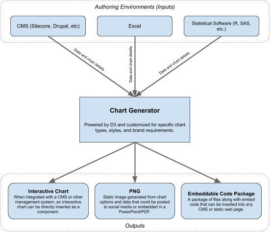
Chart Generator for Data Visualizations
We launched this integration with the Boston Foundation last month, and it’s exciting to see them already put this to good use.
The process on their end is pretty simple. The first step is for the Boston Foundation to decide where on a web page to place a chart and to decide what type of chart to use, as seen in the dialogue box below.
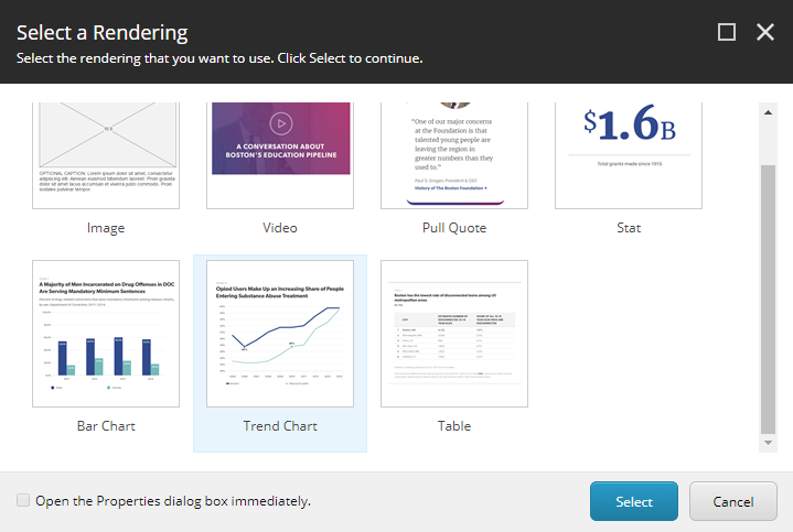
Select what type of chart to use and where on the web page to place it.
Then, they grab the data. They could upload these data as a file, but to meet the Boston Foundation’s needs, staff there thought it would be sufficient to merely paste in the data. So, we created a data field for that in Sitecore.
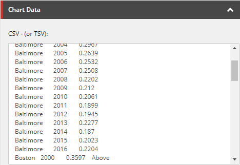
Custom Chart Data Field in Sitecore
We added additional dialogue boxes for the regular, per-chart customization Boston Indicators would want—e.g. title, subtitle, notes and sources, axis labels, etc. We set their default options to work with their most common use cases.
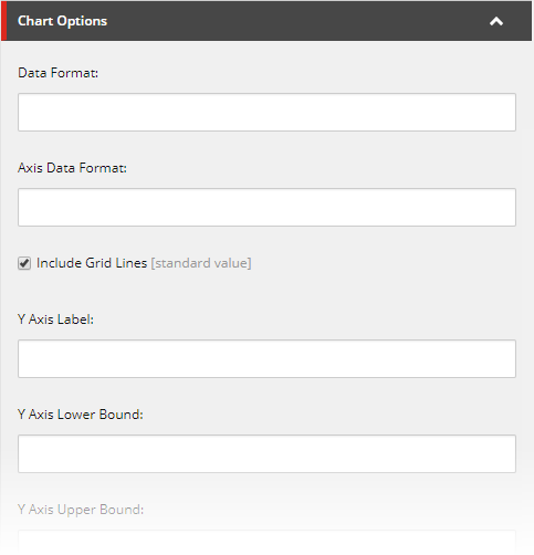
Chart Options for Data Visualization
We envision each client deciding what type of information they would want to customize for each chart. After all, the aim here is to smoothly integrate chart creation into an organization’s custom needs and workflow requirements.
Once the Boston Foundation fills in the relevant information, they press publish, and they’re done. Below we can see a chart example from this article about public transit in Boston.
"The work of creating and publishing a chart likely takes no more than a minute or two, given that we’ve automated a process to build perfectly-styled charts that otherwise may require multiple steps across separate tools."
This whole project to create custom, everyday charts for the Boston Foundation took roughly two months. There’s additional functionality we easily could have added, too. Say, for example, a client wants to tweet a chart in order to make sure the data findings are seen in their social media universe. We easily could add a download image button, in order to create a file that a client can import into Instagram, Twitter, or Facebook. Likewise, if a client wants to enable website visitors to download raw data, we can set that up as an option, too. And, as referenced above, we’ve even built a pilot of this that’s centered in Excel, which we would be happy to demo.
Of course, these screenshots don’t entirely do this new integration justice. Reach out to us at [email protected] if you want to learn more or see a demo. We’re always eager to get more input to help us refine this new way of integrating data visualization into your everyday digital workflow.