

The Role of Typography in Your Web Redesign Project
With the latest advances in digital displays, typefaces, now more than ever, can be rendered fluidly online with greater detail and clarity. One could argue that the type display gap between digital and paper has been narrowed. A well-thought-out typographic strategy can be used to convey a unique visual aesthetic, and improve usability and accessibility. This is why, when approaching your next web redesign project, taking a more focused view on typography as a brand element can help to ensure consistency for both on-and-offline experiences while elevating the digital expression of the brand.
The Many Faces of Type: Typography for Digital Brand Expression
When thinking about typography, we look at the anatomy of a character. Designers have a specialized vocabulary to talk about the different parts of letters. It isn’t necessary to commit the entire list to memory, but it is important to know that these particular characteristics illicit certain expressive qualities. These qualities can range from serious to whimsical, old-fashioned to modern. When paired with brand attributes such as colors, tone, voice, etc., the possibilities of what a designer can express in a design are nearly endless. Some brands such as The New York Times adapt their print typefaces to digital in order to leverage their storied history and experience online. Others, like USA Today's use of a sans-serif gives their site a more modern feel.

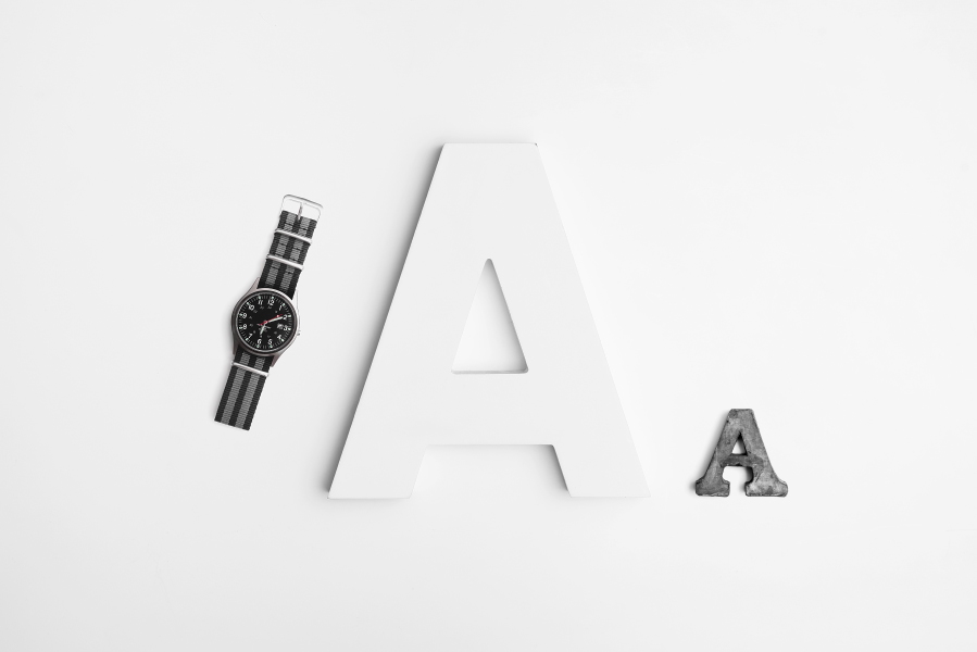
Typefaces can be used to elicit expressive brand qualities such as being trustworthy or modern.
While open sourced fonts are readily and economically available, there is a case to be made about sourcing custom or bespoke typefaces. For many brands, these typefaces are worth their weight in gold. The New Yorker’s custom typeface for example, is distinct, modern, and recognizable.

Custom typefaces are often used for brand differentiation and recognition.
It should be noted that design trends in typography are constantly evolving and the notion of “modern” can take inspiration from classic typefaces. What is important is that a type choice marries well with your brand strategy. A custom typeface can bring a lot of character to your brand; however, this may not be a suitable option for your organization for various reasons. Fortunately, the popularity and broad options for open-source typefaces today can allow brands to get the benefits of a custom typeface, when it is considered as part of a broader visual strategy that includes typesetting considerations.
A thorough typesetting exercise as part of this early envisioning of a redesign can help boost brand expression. Below, we’ll look at the science and art of typography and how it can be used to enhance the brand online.
Use Mathematics to Create Harmonious Text Layouts
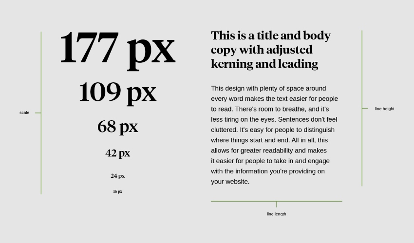
There are a lot of ways that you can make typography work to your benefit. A good place to start is to document and establish a clear hierarchy of type sizes that you want to use across a layout. Velir uses Modular Scale during early typography envisioning exercises. Modular Scale helps us explore number scales and ratios in a meaningful way. We use these scales to create a harmonious range of typeface sizes that fit well together. For example, one of these popular ratio sequences is the famed “golden ratio,” a ratio that is found in nature, and has historically been adopted for use by architects and artists over thousands of years.
In the case of web typography today, Modular Scale helps us establish a ratio sequence based on a target “base typeface” (which we call 1em). Multiplying it by the golden ratio (a special number approximately equal to 1.618), we get the next type size in the sequence, and so forth. This repetition gives a continuous range of type sizes that feel connected to each other while helping us establish a hierarchical structure.
These hierarchical structures (or scales) can be applied to various types of web design archetypes in order to achieve certain results. In the case of a marketing or blog-style website, we would look to a high ratio scale that allows us to use a higher contrast between the type scales (larger headlines in relation to body copy). Oftentimes, our clients are looking to present content rich experiences in a very compact view. These informational style websites tend to benefit from a medium ratio scale. This offers a more balanced contrast presentation of text (moderate contrast between headlines and body copy for example). It’s important to note that Modular Scale selection should be reviewed early enough in the design process in order to select a ratio that is well aligned to the page and site-level content strategy.
While Modular Scale allows us to better explore the relationship between the type sizes based on a ratio that we select, it is just a starting point. There are different aspects of typography usage on a webpage; one must also consider line length (how many characters you’re displaying on a page before the page breaks), the line height (the vertical spacing between each line of text), and of course, readability. Research has shown that the general best practice for line length is around 75 words per line as the reader can get tired and distracted if he or she has to read lines that are too long, resulting in eye fatigue.
Modular Scale and other aspects of typography to enhance readability of text.
Working with these considerations allows us to take a content-heavy site that may have lots of numbers and words and make it easier to read. Many of our projects require us to design for clarity, and we explore all usage of typography, both in content and user-interface design (navigational elements such as buttons and menus), to ensure the presentation is as clear and intuitive as possible.
To optimize this process, Velir developed a tool that not only uses a chosen Modular Scale, but also calculates the optimal line length and vertical spacing (line height) for each of the typefaces being used in the design. Every individual usage requires unique consideration, but this tool gives us some base parameters to start with when typesetting.
So far, we’ve covered typeface, sizing, and aspects of layout, but there’s another piece that goes beyond visual appeal—type usability and accessibility. This means making sure that everyone who has access to your website is able to do so equally.
Design for Usability & Accessibility
Given the ubiquity of website use across numerous platforms and devices, and by the vast number of people accessing the web around the world, it’s critical to design your site to be usable and accessible. Typography usage online touches on a number of vital areas in design—it can be used for navigational items such as buttons and call-to-action (CTA) elements, as typographical details used to create visual interest, and to display actual content. All of these need to be displayed in a way that is as accessible and usable as possible.
In order for type to be accessible, it must meet certain standards. We follow what is known as the WCAG guidelines when designing web experiences. These are a standard set of rules for accessibility online. For typography, these rules cover usage areas around color, contrast, and sizing of the text. This is important as rendering text online matters for people dealing with color blindness or other visual challenges who need a certain level of contrast ratio in order to perceive these typographical elements.
When thinking about typography in web design, we think about type elements and accessibility not only in our discovery and envisioning process, but throughout the launch of the website and beyond. Just as with a freshly-painted façade, maintenance is the key. Let’s take a look at what you can do to ensure post-launch consistency from the get-go.
Strengthen Brand Image by Creating & Enforcing Style Guidelines
It doesn’t make sense to invest in a visual strategy only to have dispersed marketing teams resort to using default typefaces out of convenience or lack of communication and clarity. So, how can large and small global organizations with distributed teams set up and enforce brand guidelines in a structured way?
A website redesign project is the perfect time to develop a design system that helps set the governance. This will help facilitate design adoption by being a hub for documentation and design patterns, such as style guides and component libraries.
Typography choices can and should be well documented within a design system to ensure that usage rules around choice and color options, including sizing standards, is conveyed with clarity. These guardrails help keep the digital expression of the brand consistent and recognizable.
The key for typography in web design is to provide enough room for creativity without sacrificing consistency. Clients that commit to maintaining and enforcing the established typography and branding standard as people join and leave, can help ensure brand consistency online.
Are you looking to incorporate typography as part of your visual strategy? Join the discussion via the comments below or Tweet Us @Velir, and feel free to reach out to us with questions you may have regarding your own brand. We’re happy to share any insights we can to help you create the aesthetic and brand image you’ve been envisioning!